Sunday, March 10, 2013

Miami Nice

Colony Hotel, Miami, FL
Courtesy Colony Hotel by Daniel Siskind
Ocean Drive, Miami Beach, Florida - (BTT) Few places in the world are so intrinsically linked to an architectural style as Miami Beach is to Art Deco. Cruising down Ocean Drive is an experience the exists no where else on earth, and among the pastel-colored Streamline Moderne hotels that line the street, the Colony stands especially iconic. Built in 1939, the hotel and the neighborhood weren't always as glamorous as they are today - in a bit of irony, it was thanks in part to shows like Miami Vice and movies like Scarface depicting the rather seedy state of the area in the 1980's that helped renew interest in South Beach and assuring landmark status for gems like this.

Sunday, March 3, 2013

Hermit Habitats

Cliffside Monastery
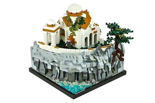
Courtesy Cliffside Monastery by Paul Vermeesch
Chastity Cliff - (BTT) It's one thing to want to get away from it all and find a nice little place to yourself by the sea to unwind as a vacation - it's another thing to make it your life. Further from society but closer to his creator, this lonely monk has just the sounds of the ocean below to keep him company. Fortunately, he also has a humble abode that might be small in footprint but is big on details. The clean, white stucco walls give a nice contrast to the surrounding landscape and provides the perfect blank backdrop for a lifetime of meditation.

Tuesday, February 26, 2013

Seaside Stay


Courtesy Hotel Creators by OliveSeon
Ocean Drive - (BTT) While we have done our fair share of covering the very best in hospitality over the year, I dare say this might be the most opulent let, if only for the site alone. Perched just feet away from the ocean, the Hotel Creators dwarfs the buildings around it, including the adjacent lighthouse. Thankfully it does its guests a great service is being beautiful in addition to big - a grand entry sets the stage at the ground floor, while the rest of the building's massing is playfully broken up with a series of setbacks, towers, and balconies.

Monday, February 18, 2013

Microscale Monday 02-18-2013

Another mini LEGO house
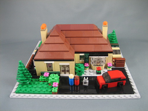
Courtesy mini LEGO house by ninbendo
Tinytown - (BTT) After a some recent (and stunning) examples of modern single-family residences, it's nice to return to a more traditional little slice of suburbia. This one-story charmer might be small in footprint, but is large on details - especially nice are the gardens and bay window overlooking the driveway. For this happy couple and their dog, it might not make the cover of the next issue of Mansions Monthly, but it is home.

Monday, February 11, 2013

Microscale Monday 02-11-2013

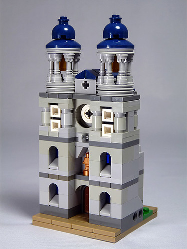
Courtesy Basilika by moctown
Abbey Road - (BTT) Religion is a touchy subject, as proven with the announcement that the Pope decided he's had enough of wearing pointy hats and riding around in Tupperware cars. Still, regardless of your own personal relationship with the higher power of your choice, it's hard to deny that some of the most important architecture is divinely inspired. This basilica, beautifully topped with striking blue roofs, exemplifies this point as well as any structure.

Sunday, February 10, 2013

C'est Magnifique

Avenue Saint-Jacques
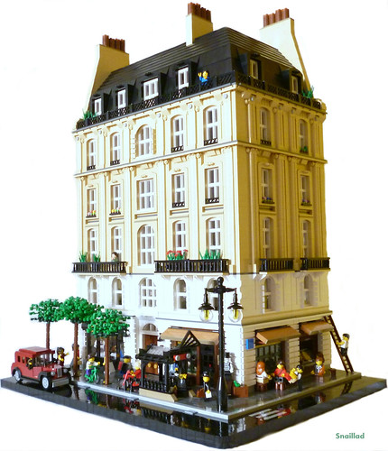
Courtesy Avenue Saint-Jacques by snaillad 
Paris, France - (BTT) When you close your eyes and imagine Paris, likely the second thing to come into frame after the Eiffel Tower are the broad avenues lined with classical buildings such as the stunning example above - shops and restaurants on the bottom to encourage an active streetscape, apartments above to keep the buildings active at all hours of the day. While never becoming the household name that Gustave Eiffel has, at least not internationally, Georges-Eugène Haussmann deserves just as much credit for giving the City of Light its iconic look. Conveniently located right at the entrance of a Metro station, this building is more that just a pretty facade. Go inside you will find a lot going on - restaurants and cafes, dentist offices, and apartments that are the height of luxury.

Wednesday, February 6, 2013

Geometric Gem

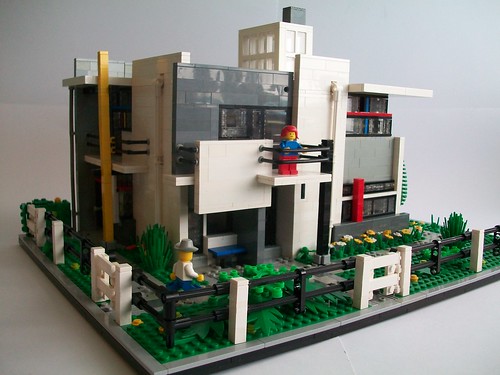
Courtesy Schröder House by TechnicNick 
Utrecht, The Netherlands - (BTT) We seem to be on a bit of a modernist kick at the moment, and for good reason - not everything needs moldings to be a masterpiece. The Schröder House, designed by Dutch architect Gerrit Thomas Rietveld and completed in 1924, proves this to be true. Quite possibly the best architectural expression of Neoplasticism (De Stijl to the locals) ever created, the Schröder House is made up of a series of intersecting planes with key elements highlighted in primary colors. Inside the building is almost completely open with a virtually wall-free interior - quite radical at the time, when the concept of loft apartments were still decades away from being trendy.

Sunday, February 3, 2013

Scandinavian Simplicity

Courtesy Villa Whiteout by birgburg
Scandinavia - (BTT) Looking just as good now as when it was first built back in the 1930s, this modern dwelling is newly renovated and ready for the next eight decades. The pure white facades punctuated by black trim on the windows and doors is a classic look for the era, but a bit of brickwork helps bring a little color and contrast to the composition. On the ground floor in a beautifully open plan is a living room wonderfully detailed with ample seating and a cow skin rug in addition to a kitchen sure to please any aspiring chefs in the family. Head up the spiral stairs to the upper level to find the master bedroom, complete with a walk in closet and private terrace.

Saturday, February 2, 2013

Parcel Police

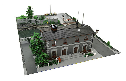
Post office / Police depot - front
Courtesy Post office / Police depot by Maciej Drwięga
Over by the train tracks - (BTT) Every so often the post office raises the cost of a stamp by a penny, and every time they do people get in a panic as if the idea of something increasing in price over the years is unique to the evil mind of the Postmaster General. The ability to stuff any document in an envelop and have it delivered by hand to any address throughout the entire country in no doubt worth 45 cents, but now they want 46 cents!? Truly this is an injustice for the ages! This charming little building has the right idea - should any irate customer throw a tantrum about a service that still costs less than a gumball, all that the great employees of the post office need to do is knock on the party wall and the neighboring police will rush in to help defuse the situation. 

Monday, January 28, 2013

Microscale Monday 01-28-2013

Bank Complex
Courtesy Bank Complex by Luap31
Downtown Brickville - (BTT) Holding down an important spot on the river, this Bank Complex is a shining example of the International style. While this site tends to skew towards the traditional and the ornate, like a raccoon fixated on a shiny object, make no mistake - a simple, clean, wonderfully proportioned Modernist building is just as compelling.

Sunday, January 27, 2013

Good for What Ails You

Full view 1
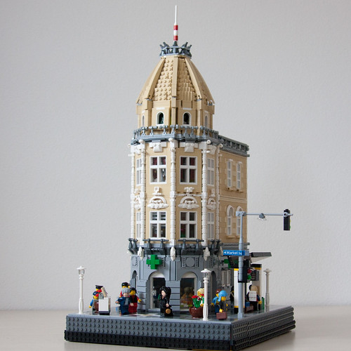
Courtesy Pharmacy and Doctors by cimddwc
Market Square - (BTT) It's officially cold and flu season, and this year is a real doozy. It's such a horrible and helpless feeling to be sick, but thankfully this classically detailed beauty of a building has you doubly covered. On the ground floor is a pharmacy, perfect for when you realize that all the chicken soup in the world isn't going to cut it and you need some real medication to see you through the day. Of course the best way to know what you need is to actually visit your doctor, and as luck would have it several can be found on the floors above. Science may never find that cure for the common cold, but I suppose a runny nose is a small price to pay for architecture this good.

Saturday, January 26, 2013

Architecture Elevated

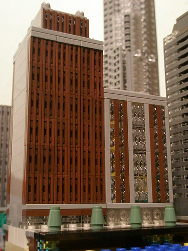
Lego MOC: Tall Tower
Courtesy Tall Tower by RedCoKid
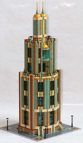
Altitude Avenue - (BTT) No invention is as important to the development of the skyscraper than the elevator - after all, what good is building 30 stories high when your average person gets winded after 3 flights of stairs? The downside is that most of the time ones vertical transportation is confined to a small, windowless box in the core of a building. Not here. Proudly trading claustrophobia for acrophobia, this Tall Tower features a glorious glass elevator sure to be the envy of high-rises and chocolate factories everywhere. While you are enjoying the view of the surroundings, don't forget to take the opportunity to admire the details right next to your nose - this is one facade that deserves a second look.

Thursday, January 24, 2013

The Future Looks Bright

Courtesy 2063, Seoul by OliveSeon
Seoul, Korea, 2063 - (BTT) Fifty years from now, who knows what the future will hold? Mankind has a fairly horrible track record when it comes to guessing what's still to come. Ask someone fifty years ago what life would be like in our modern day, and I'd bet you would get a lot more predictions of flying cars and moon bases than you would about phones than fit in your pocket that can access this global online network of just about every piece of information ever recorded. Flash forward to 2063 - it seems that cars are still under gravity's cruel grip, but the architectural landscape has become a striking hybrid of old and new. Now's the time to buy stocks in the manufacturers of transparent blue tubes - you can thank me later when you're retired millionaires.

Monday, January 21, 2013

Microscale Monday 01-21-2013

Commission - Charlevoix Public Library
Courtesy Charlevoix Public Library by Paul Vermeesch
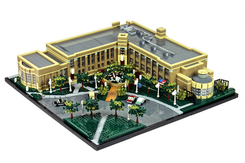
Charlevoix, Michigan - (BTT) Currently housed in a historic 1927 building, originally designed as a middle school, the Charlevoix Public Library proves that the need for books still is strong, and having a place to put them is as important as ever. Not to take anything away from the Kindle and iPad faithful, but there is something to be said for having a real book with real paper in your hands (paper cuts notwithstanding).

Fixes and Features

You may have noticed a few changes to the site over the last couple weeks. As promised, no big, sweeping changes are in the wings, but there were a couple things I couldn't help but tweak. The site has a revised banner and a new, cooler color scheme (cooler meaning it leans towards the blue end of the spectrum, but hopefully the other definition also applies). I've moved the site-related items in the right panel up to the top, fixed a few of the non-functioning parts, and updated the links in the Categories tab - I plan to revamp it a little more in the coming weeks and am thinking of some other ways to freshen up the tabs.

I am also introducing a new feature to BTT - Microscale Mondays. I've always had a fondness of microscale buildings, and occasionally have posted one or two, but I realized that I have been ignoring a lot of impressive creations because they weren't done in the official modular style - a style that quite frankly is not feasible to everyone due to the cost of parts needed to make them. I'm going to keep my definition of "microscale" pretty loose, and I don't see this happening every single Monday, but I felt it was time to give these little guys a place to shine. Appropriately, at least for us in the United States, today marks the inaugural post of this feature - you probably already saw it if you are reading this now.

Finally, I'd like to thank you all for helping spread the word of our new domain and for continuing to visit our site - each new day sees slightly more visitors than the day before. I've also noticed a common trend with feedback from you, the reader - that being there is no feedback. With every website constantly thinking of new ways to ask its visitors to comment, share, answer polls, or participate in some way, I'm quite content to keep this a relatively one-way street - I write, you read. I do encourage feedback if you have it, of course, but I personally enjoy sites that ask nothing of me but a few minutes of my time - you seem to feel the same. So sit back, enjoy, and know that creating new and wonderful LEGO architecture is what really keeps this site active.

- Jonathan

Sunday, January 20, 2013

State of the Art

Art Gallery
Courtesy Art Gallery by crises_crs
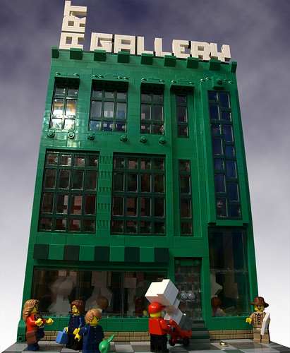
Old Industrial District - (BTT) As Andy Warhol once said, “Art is what you can get away with” - this author doesn't disagree. There is certainly nothing wrong with different people liking different things though, and perhaps no other place proves that as well as your local art gallery. Opting for a converted loft space with tons of natural light, this gloriously green gallery is constantly acquiring new pieces, much to the chagrin of the delivery men that need to navigate the stairs without damaging the work. 

Wednesday, January 16, 2013

The Woman and the Window

Brick Noir
Courtesy Brick Noir by Ru Corder
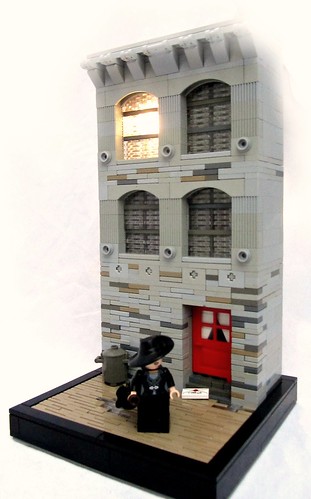
Bleak Boulevard - (BTT) The light is still on in the office of the hardboiled detective currently residing in this gritty piece of the urban streetscape. A femme fatale, her hat hiding her eyes almost as well as her words hide her true intentions, just stepped through the scarlet door to the misty alley beyond. Beyond these walls, as grey as the perpetually raining skies, the two seem to have entered a business arrangement that just reeks of trouble and cigarettes. Best keep that revolver (and umbrella) close.

Sunday, January 13, 2013

A Guiding Light

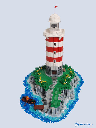
Lighthouse on an island
Courtesy Lighthouse on an Island by 1982redhead
Beacon Island - (BTT) They say being a lighthouse keeper is one of the loneliest jobs in the world, but how bad can it really be? A place of your own on oceanfront property, everyday is casual Friday, and shaving is not only optional, but discouraged - sounds pretty sweet to this author. I suppose one could always get a dog for company - yet another job perk. Standing tall along the jagged shore, this lighthouse, in its traditional red and white stripes, looks just and handsome by day as it does by night. Perhaps not the most active work environment, but certainly one of the most striking.

Friday, January 11, 2013

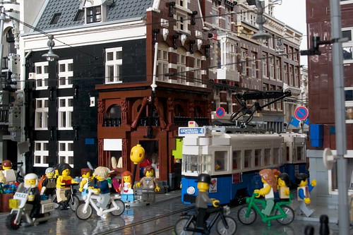
Hustle and Bustle

Courtesy Amsterdam Keizersgracht / Utrechtsestraat by patrick_bosman
Amsterdam, Netherlands - (BTT) Every now and again, it's nice to pull back from the buildings themselves to look at things in the larger context. Just take a look around - a kid with balloons, a mother and daughter on their bike, a tram full of people weaving through the pedestrians using the power lines overhead - you'd be hard pressed to find a more active streetscape. The architecture might be taking more of a background role, but don't for an instant think of that as in insult. Sometimes the best buildings (and this street has some great ones) are content to lay back and let the focus stay on those who get to enjoy them.

Tuesday, January 8, 2013

Redwood Residence

Modern House
Courtesy Modern House by ZeeMasterBrick
Northern California - (BTT) This house might not have an organic curve to be found, but that doesn't mean it isn't one with nature. Nestled among the mighty redwoods, this thoroughly modern abode embraces its surroundings while still making a statement of its own. Ample windows let you look out over the rocky terrain and freakishly tall flora, while the large cantilevered roof over the balcony allows you get a little fresh air while still feeling like you're securely inside.

Sunday, January 6, 2013

Last Train to Brickville

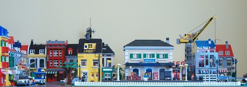
Jan_2013_overview
Courtesy Jan 2013 Overview by salvobrick
Brickville - (BTT) Celebrating its 5th anniversary this year, the lovely little town of Brickville ain't so little anymore. Expanding not only in size but also in the different architectural styles populating the street, don't count on the citizens taking the year off to admire all they've done - signs of new construction are ever present in the background. Here's to next 5 years (and many more after that)!

Thursday, January 3, 2013

Coming Up Clutch

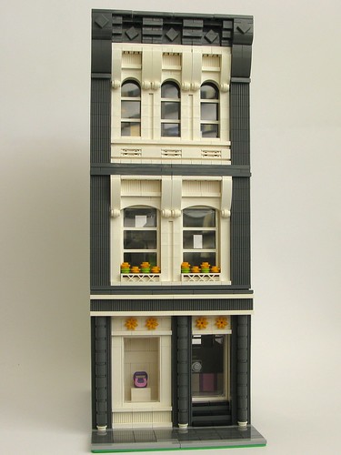
Coveted Clutch - Front
Courtesy Coveted Clutch by kjw010
SoHo, Manhattan - (BTT) It's quite the dilemma. Do you just go to Canal Street and haggle for a "genuine" Louis Vuitton handbag, hoping against hope that no one looks too close at the tag and crossing your fingers that you'll never need to carry more than 3 ounces of stuff at once or risk the bottom from falling out? Or do you bite the bullet, walk those few blocks north, and invest in something quality made. Coveted Clutch, housed in this stately monochromatic masterpiece, features all the designer handbags you can shake a credit card at; upstairs lives the designer herself, the pastel interiors playing well off the dark grey street facade.

Tuesday, January 1, 2013

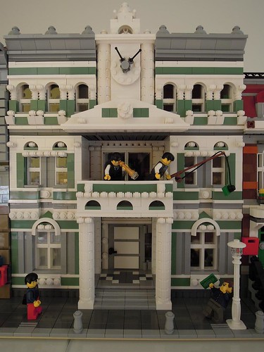
Fiscal Balcony

Tax Office
Courtesy Tax Office by fuchsp1
Certainty Street - (BTT) We're just a few hours into the new year, and already there are a bunch of people in a panic over the state of their taxes. However, not everyone is doom and gloom it seems. Here at the Tax Office, business has never been better nor has the future ever looked brighter. Housed in a building the same color as your hard earned dollars, the head honchos are always willing to go over your deductions (and help you improve your putting). Refunds are hard to come by, but if you have long arms and a decent vertical leap, you might get back a little of that paycheck.