 |
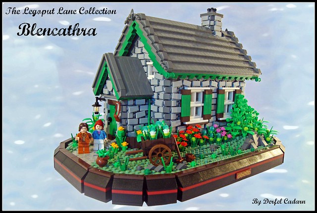
| Courtesy Blencathra by Derfel Cadarn |
Monday, April 30, 2012
Olde English
Sunday, April 29, 2012
Under Construction
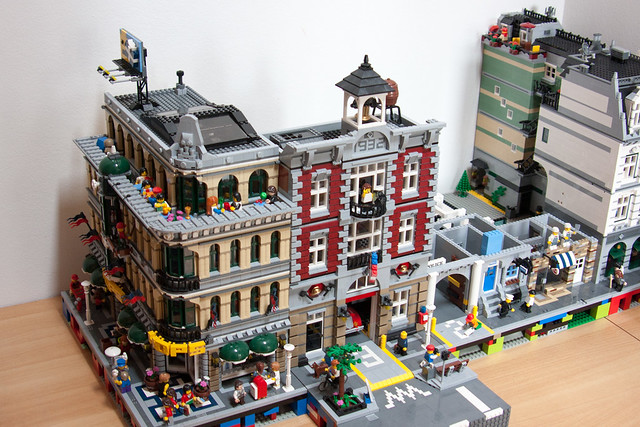 |
| Courtesy GGE, FB2 preview by Cimmdwic |
Categories:
Big,
Cafe,
Construction,
Fire Stations,
Layouts,
LEGO,
Shops,
Store,
WIP
Saturday, April 28, 2012
What Happens in Amsterdam...
 |
| Courtesy Amsterdam Hotel by BrickCityDepot |
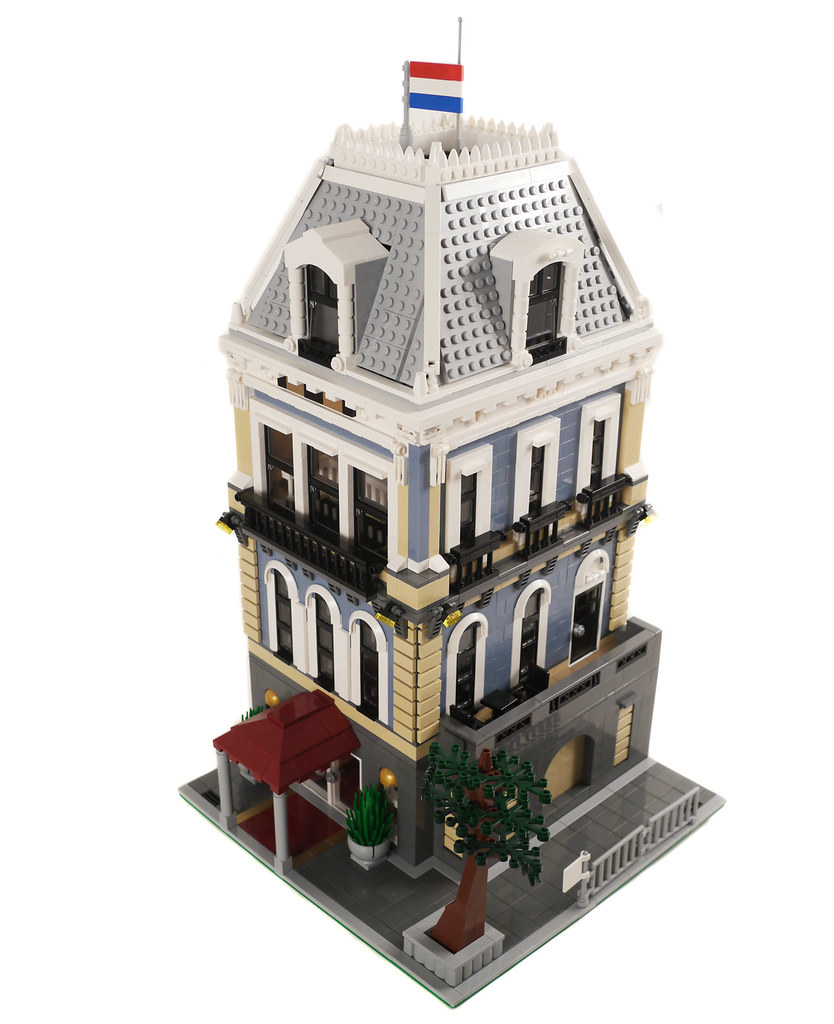
Amsterdam, The Netherlands- (BTT) As one of the oldest cities in Europe, Amsterdam has had its time to rack up a large number of beautiful buildings. This is one of those buildings. From the elegant rooftop, to the awning over the entrance, this building screams beauty and elegance. The interior doesn't disappoint either! From a hotel logo on the rug adorning the foot of the stairs, to the mailboxes for the residents, the dual suites, a small landing leading to an even smaller balcony, this modular doesn't disappoint. May I suggest the caviar, sir?
Also, this is our 1,200th post! A big thank you to all of our readers and followers for making this possible!
Friday, April 27, 2012
Modular Building Blues
 |
| Courtesy Lego MOC: Blue Boardwalk by RedCoKid |
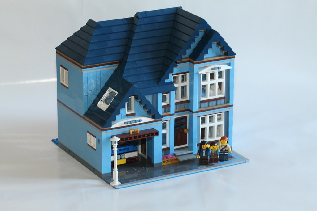
Azure Drive- (BTT) Here we have what looks to be a lonely suburban modular house. But, one shouldn't always judge a book by its cover. Over here, Flickr user Red Co. Kid has built an entire city block of modular buildings in various shades of blue! From a blue rendition of the Cafe corner, to this great suburban home, it's all there! The buildings feature details such as stoplights, play sets, full interiors, a garage, Olivia's workshop, and even a microscale rendition of the very town that it exists in!
Categories:
Blue,
cafe corner,
City,
Dark Blue,
Layouts,
LEGO,
Medium Blue,
MIcro City,
Suburban house
Thursday, April 26, 2012
Inspiration of the Day 4-26-12
 |
| Courtesy House in beach Palabritas by Archdaily |
Time for more inspiration! I'm truly a sucker for soft colours and shiny buildings, so this one jumped right out at me. This house, designed by Jose Orrego in Palabritas Beach, Lima, Peru has an amazing touch built into it. The rounded rectangle in the front of the building acts as as a "frame" to the beach and nearby islands on the other side of it. These curves would be a challenge to recreate in Lego, but if they were well achieved, the result would be beautiful. Get building!
Categories:
ArchDaily,
Beach House,
Inspiration,
Modern
Tuesday, April 24, 2012
Smart-Bricks
Hello all!
I was asked by Jordan Vincent to make a post on the behalf of Smart Bricks. Here's what he has to say:
Smart
Bricks, a new unofficial LEGO store opened few days ago. But what is it, what
does it sell? Smart Bricks sells models created by designers. That is to say, if you are a designer and you
want to share your models, ask them and they will create instructions, a box,
and buy the pieces to make a complete set. Then anybody can order the set on
Smart Bricks and enjoy the model!
One model, “The
Magic House” is now available! It’s a beautiful Victorian house and contains
nearly 2000 pieces. It has been designed by Valgarise. Other models will be available soon.
Visit www.smart-bricks.com for further information!
Check it out if you get the chance!
Monday, April 23, 2012
I Can See for Miles and Miles...
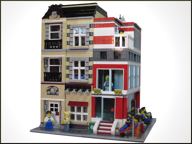
London, England- (BTT) Glasses are a really great invention, without them we would all be moles, with no sense of vision, feeling around our blurry surroundings with only our nose as a guide! While minifigures have had glasses since the first variation from the classic smile, they've never had somewhere to get them, until now! The Brick Glasses Shop is the #1 destination for minifigs of all sizes when less than 20/20 sight is not an option. With 3 fully furbished floors, including, but not limited to, a bathroom, kitchenette, and dumpster, this building is chock full of detail. And it's partner doesn't look bad either!
Full disclosure, this is my own MOC, but it absolutely destroyed my collection of tan bricks, to the point that I had to use two trips to a Pick-A-Brick wall to get the necessary parts. It's also the main reason why I've been posting somewhat infrequently lately, so I promise more juicy Modulars to come your way soon!
 |
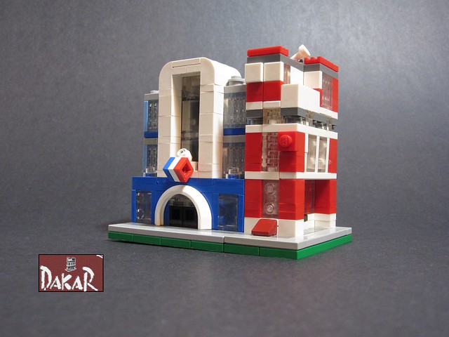
| Courtesy Terraced Street Corner by Dakar A |
Full disclosure, this is my own MOC, but it absolutely destroyed my collection of tan bricks, to the point that I had to use two trips to a Pick-A-Brick wall to get the necessary parts. It's also the main reason why I've been posting somewhat infrequently lately, so I promise more juicy Modulars to come your way soon!
Categories:
Buildings,
City,
Corner,
Dark Red,
England,
Glasses Shop,
Layouts,
LEGO,
Modern,
Opthamology,
Store,
Tan,
Terraced House
Sunday, April 22, 2012
Orange Crush
 |
| Courtesy Modular Orange Bank by Myko |
Friday, April 20, 2012
1 Million Page Views!
And there we have it! Brick Town Talk has officially broken over 1 million page views this week...at least since Blogger has been recording! Anyways, thanks a lot everyone!
-Chris
Thursday, April 19, 2012
Dark Streetcorner
 |
| Courtesy Dark Medium Flesh House by 1982redhead |
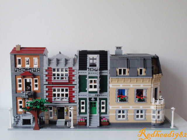
EDIT: Oops! I've been informed by the builder that the corner building has a bathroom! Looks like all four buildings will have to share!
Wednesday, April 18, 2012
Inspiration of the Day 4-18-12
 |
| Courtesy Fractured House by ArchDaily |
Categories:
ArchDaily,
Architecture,
Colorado,
Houses,
Inspiration,
Rebuilding,
United States
Monday, April 16, 2012
Antique Freaks
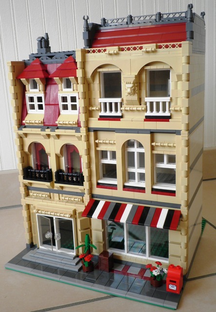 |
| Courtesy Antique Shop by Castor-Troy |
Categories:
Antique,
Dark Red,
Eurobricks,
France,
Green Grocer,
Historical,
LEGO,
Store,
Tan
Friday, April 13, 2012
Coco before Chanel
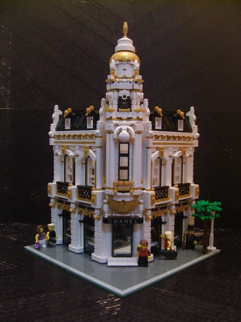 |
| Coutersy No. 5 by Jared Chan |
Los Angeles, California- (BTT) L.A.- The land of the rich and famous. Style. Glamour. Fashion, from around the world- Milan, Geneva, and Paris. Coco Channel has been a fashion icon for near 100 years now, and so it is fitting that their store gets a beautiful Modular building treatment. The amazing white-on-black with gold overlay colour scheme, the central tower, and the interior are just a few notable high points of this beautiful building. Because, why spend your money down the street at some other fashion store, when this beauty is within your field of vision?
New Sharing Buttons!
Hello all!
Off to the right, you can see our new like buttons for Facebook, Twitter, or Google Plus.
EDIT: It's on the left side of the entire webpage now!
Thank you, AddThis!
Chris
EDIT: It's on the left side of the entire webpage now!
Thank you, AddThis!
Chris
Monday, April 9, 2012
Mini Modular Mania!
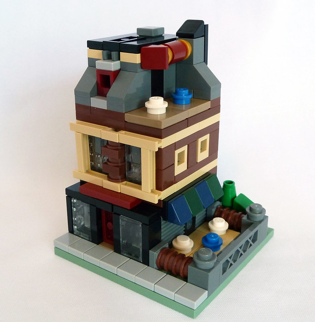 |
| Courtesy XJ550, Mr. Attacki, Dakar A, and dhaas06 (In order) |
Categories:
Contests,
LEGO,
Mini Modular,
Toys n' Bricks
If the Shoe Fits...
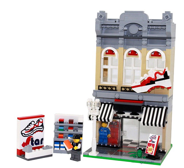 |
| Courtesy Star Athletic Shoe Shop by L. G. Orlando |
Saturday, April 7, 2012
Ivy Lane Pub Crawl
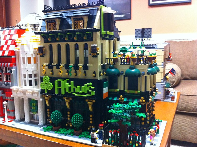 |
| Courtesy Arthur's Pub by Ace Copeland |
Turning the Corner
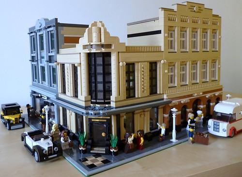 |
| Courtesy 1940s Corner by snaillad |
A Good 70 Years Ago - (BTT) There is just something about the period between the World Wars that evokes a certain level of nostalgia, despite the fact that most who feel this way were born far too late to experience the era themselves. The fashion, the cars, the fact milk was delivered right to your door - things simultaneously foreign yet strangely familiar. At the top of the list, at least in this authors opinion, was the glorious Art Deco architecture, and this scene is blessed with 3 postcard-worthy examples of the style. On the far left is a tailor (does anyone even go to those anymore?), at the corner is a bar, and on the right is a bakery. Each have interiors as well thought-out as the exteriors, proving once and for all that they really don't make 'em like they used to.
Wednesday, April 4, 2012
Modern Architecture
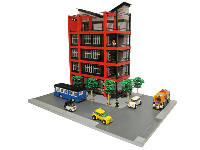 |
| Courtesy Vee Building by Brickapolis |
Categories:
Apartments,
Black,
Brick Street,
City,
LEGO,
Modern,
Multi-Story,
Red,
Townhouse
Tuesday, April 3, 2012
Best rates in town!
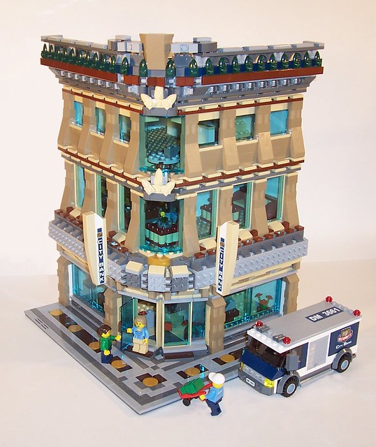 |
| Courtesy MOC7 by The LostLostBoy |
Monday, April 2, 2012
What I've Been Up To
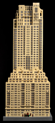 |
| Courtesy 15 Central Park West by Jonathan Grzywacz |
New York, New York - (BTT) If you noticed a bit of a lull in posting the past month, I am proud to finally share with you the major factor behind it - I was hard at work on the above model of Robert A.M. Stern Architect's 15 Central Park West, which is now on display in Washington, DC as part of the National Building Museum's exhibit LEGO Architecture: Towering Ambition. It was a true challenge to get it done (only 6 weeks when I tend to take 6 months on a modular), but I am very happy with the end result. It stays on display until Sept 3, 2012, so should you find yourself in the nation's capital (well, the United State's anyway), I urge you to make the trip - it's a great museum with many other interesting exhibits to take in.
Many more stats are in the description on my flickr page.
Roadkill Grill
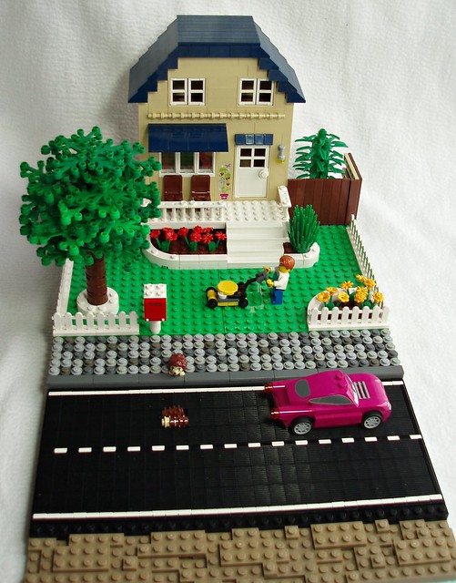 |
| Courtesy Look both ways... by Eilonwy77 |
Categories:
Dark Blue,
fence,
Friends,
hegehog,
lawn,
LEGO,
SNOT street,
Suburban house,
Tan
Sunday, April 1, 2012
Inspiration of the day- 4-1-12
 |
| Cité Municipale de Bonneuil-Sur-Marne by Archdaily |
These days inspiration always seems to be from the world around us, and sometimes, just our imaginations. But sometimes, it's nice to take a dive into the imagination of another person. This excellent concept image of the Cité Municipale de Bonneuil-Sur-Marne shows many great concepts, while keeping a modern, restrained facade, and showcasing the inside with its glass exterior. It creates a great flow, between the interior working space, and the exterior, natural world. The building helps define the landscape, showcasing man's ingenuity, while still showing appreciation of mother nature.
Exit Through the Tat Shop
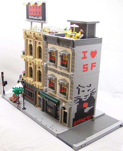 |
| Courtesy VirtuaLUG Layout by Tigmon74 |
San Francisco, California - (BTT) Real estate values have just gone up in a city where they are plenty high already thanks to a certain British artist who has left his signature mark on the side of a building that does the same to human flesh. Graffiti aside, there is a lot to love about this pair of buildings - it's worth taking a closer look at the sports bar on the corner to appreciate some of the clever detailing there. Residents of the apartments above can even enjoy a bit of sun on their roof terraces, assuming they can find a break in the fog.
Subscribe to:
Posts (Atom)


