Thursday, March 31, 2011

A Display to be Reckoned With

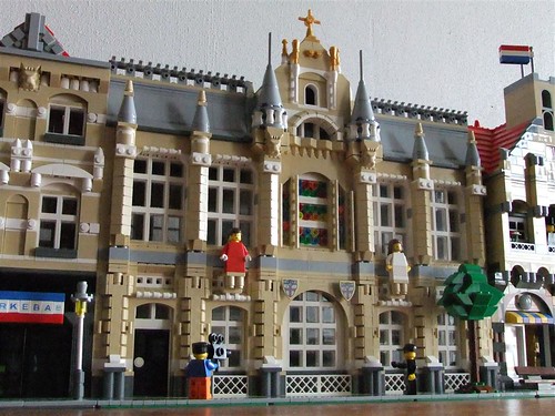
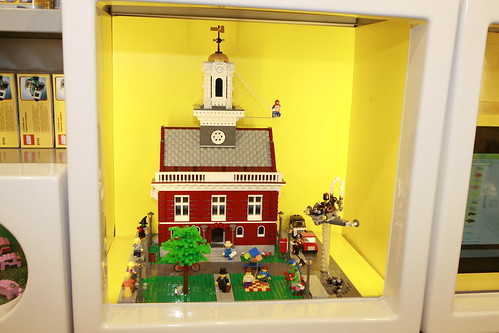
Here's a great little LEGO store-featured display of a city hall. We've been seeing some works in progress from him for awhile, so I'm glad the finished product turned out so well! 

The Marvelous Mediterranean

Courtesy Mediterranean Town by Alibabo
You have to check out the roofs on these buildings. They add such a unique character to each building. I also like the little compactness of this town layout. Very neat!

Navigation Bar

Hi everyone!

I moved the navigation bar to the left sidebar. I'm just seeing how this looks on the site and whether it will be more helpful. Thoughts and suggestions welcome!

Chris

Wednesday, March 30, 2011

Gizmos and Playgrounds

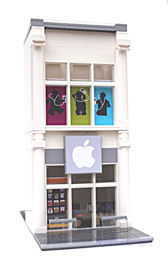
Courtesy Apple Store by lgorlando
LGOrlando brings us another spectacular model, this time an Apple Store. It's a sign of the times...but wait! A playground has also been built! Take your pick on which to visit! Here's a link to his Flickr.

Tuesday, March 29, 2011

Last Day To Vote!

If you haven't voted in the "Drawings" poll, make sure you do! It's the last day to vote, and I'd like all the feedback I can get.

Thanks!

Chris

P.S. I also wanted everyone to know that since July of 2010, when the first site stats started coming in, Brick Town Talk has accumulated a little over 270,000 page views. In fact, we're on track to break 35,000 page views just this month! So thank you to all that visit the site! I think this is a good accomplishment.

Monday, March 28, 2011

The Czechs Know What's Up

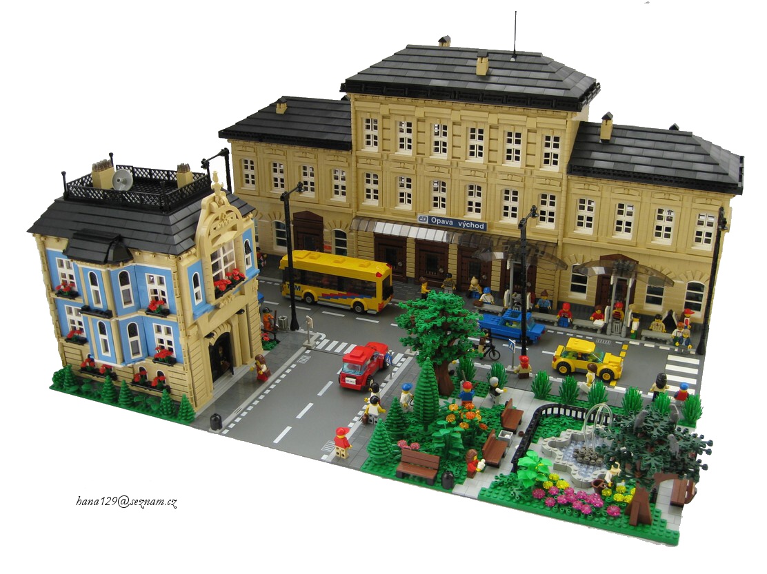
Courtesy Opava Vychod Railway Station by hana129
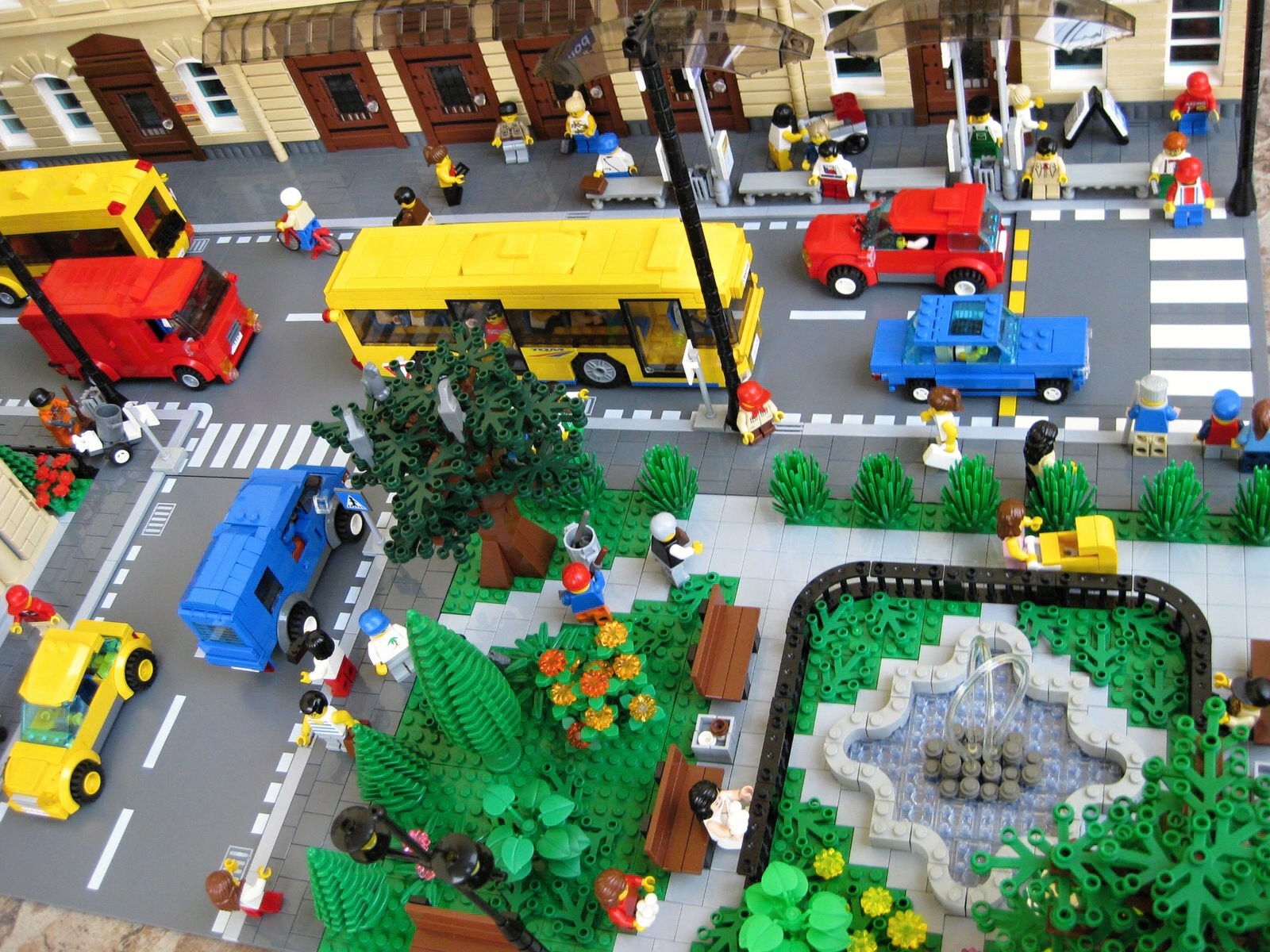
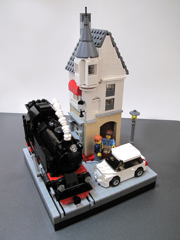
The one thing I really like about Brickshelf is that one thing just leads to another. Right when I plan on posting something, I find another incredible model. It has probably happened to me 10 times now! This model happens to be a layout, and a beauty at that. Both the house and the train station are based off real buildings in the Czech Republic. They're astonishingly similar. Awesome job on this and make sure to check out all the details!

Wander off to the park

Sunday, March 27, 2011

A Rocky Gas Station

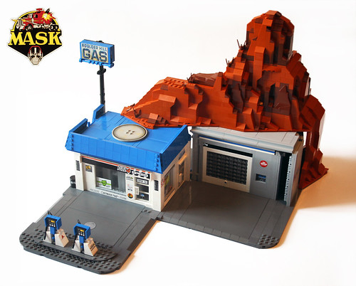
Courtesy Boulder Hill by "Orion Pax"
Now how cool is this? A gas station in the side of a hill, which also transforms. Click through to see the other photos, it's well worth it.

Saturday, March 26, 2011

A Day in the Upper West Side

Courtesy New York Brownstone by Brian Lyles
It's safe to expect anything and everything out of Brian Lyles. His new brownstone building features an exceptional interior, complete with an L-shaped sofa! Head on over to MOCpages to see all the pictures.

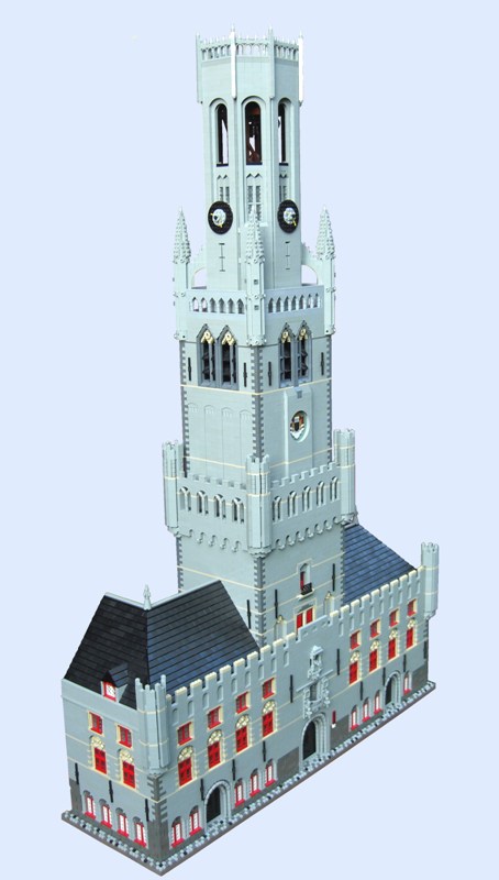
A Belfry Can Be A Skyscraper

Courtesy The Belfry in Bruges by Reejoc
You can see this probably took a small truck load of pieces to complete, but wasn't it worth it? Compare it to the real thing in Bruges, Belgium.  

Hardware on the Go

Courtesy Hardware Store by stefauster
A very ornately designed hardware store. The arches over all the doorways and windows are fantastic. And who's to say that skylight isn't awesome as well? Very cool model. Check out the interior shots and handy delivery truck too!

Wednesday, March 23, 2011

Jail's Not Fun

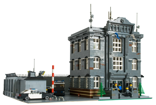
Courtesy Police Department by Dark-Alamez
Bingo! Right up my alley. From the man that brought you the Chicago Style buildings comes a police station, complete with graffiti driven crooks. I love these types of structures. Big, solid, and dominating. A very old-fashioned and classic design that I find just awesome. Great style on this one. Keep it up!

Don't Fall in the Tracks!

Courtesy Corfe Castle Station by Carl
Okay, so a couple days ago, a reader commented that they wanted more train stations. I'm glad they said that, because today I stumbled across this enormous and magnificent model of the Corfe Castle Station in the UK. I really like the look of this model...everything just seems to work. The colors blend nicely, and the style of architecture is very neat. Great work!

Tuesday, March 22, 2011

The Street of Half-Size Sets Grows

Remember the half-size Cafe Corner? How about the half-size Fire Brigade? What about the half-size Green Grocer?

Wait, we didn't blog that last one yet. Puddleglum snuck that one past us earlier this month. Here's a photo:


I think you see where this is going. Here's a half-size Grand Emporium, courtesy of Puddleglum:

Monday, March 21, 2011

A Tour of Amsterdam

Courtesy Amsterdam by Lasse
Boats, trucks, buildings, and minifigs: everything a good layout should have.This is just incredible, loaded with all sorts of great details. However, just this picture doesn't do justice, so please be sure to check out the whole folder!

Artist at work

Here's the Train!

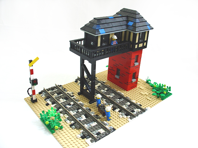
Courtesy Signal Tower by elalfreddo
I really like this model. The transition in the tower from brick to the wood style siding common in Europe is very neat. I really need to buys some train stuff here soon....

Speaking of which, I'm doing a research paper on the train industry in North America, and it's apparent "revival" in the United States. For all of you train fans out there, do you think there is going to be a major growth in the industry? Just curious as to what you think. Leave a comment or thought!

Saturday, March 19, 2011

MetLife Goes Mini

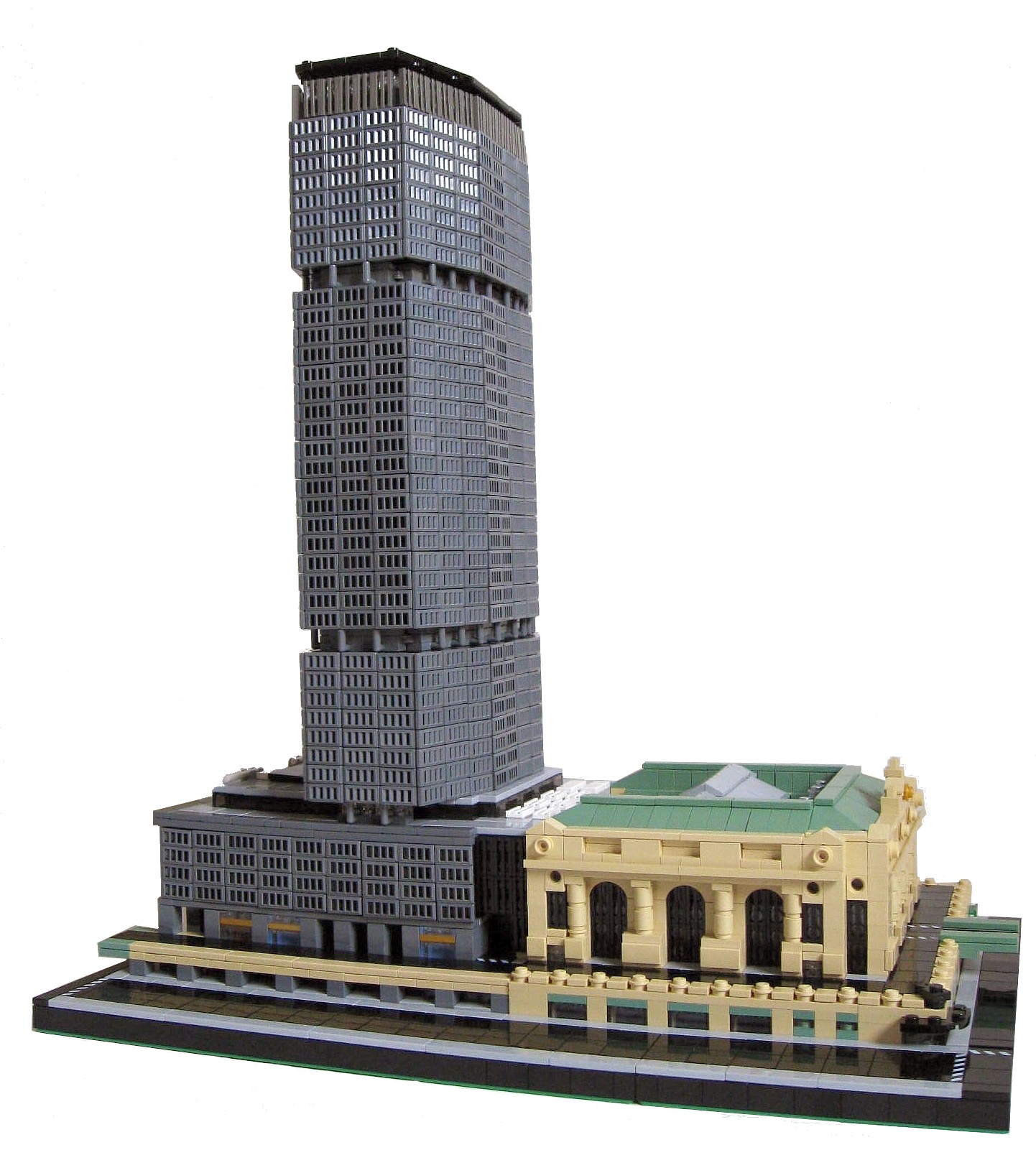
Courtesy MetLife Building by srezkall
An incredible mini model of the MetLife Building in New York City. I can't believe how realistic looking this is! Make sure to check out his other skyscrapers too.

Friday, March 18, 2011

Waiting on the Train

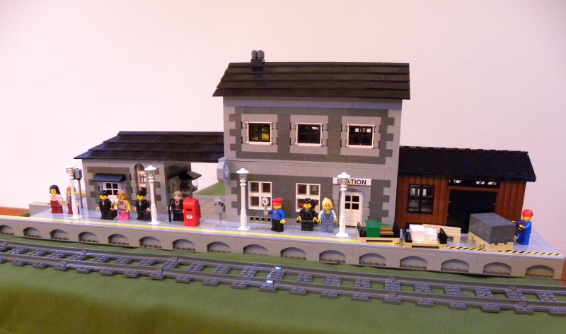
Courtesy Station by LEGO-Train-12-Volts
A great little model by Brickshelf user LEGO-Train-12-Volts. The small size to this makes it all the better, it's simple but effective. My favorite part is probably the attached storage shed on the side with the brown really contrasting from the rest of the model. Make sure to check out all the interior pictures too!

Shop in the Downtown

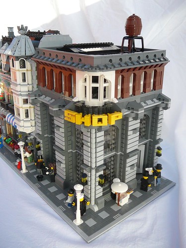
An awesome old-fashioned department store with a tall brick and window facade for the lower two levels. Colors work well, and the top hat minifgures are just a great touch of realism. Nice job!

Thursday, March 17, 2011

Japan Relief Effort

Hello everyone,

This has nothing to do with LEGO, but please visit the American Red Cross if you consider donating. This has been a brutal past week for Japan, so every little thing counts. 

Chris

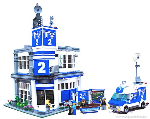
News, Sports, and Weather

Perhaps some of our older viewers remember set 6661 Mobile TV Studio , a pretty tiny set to say the least! However, lgorlando brings it back in the spotlight with a revamped van and studio! Catch the news and watch the weather or cruise around in the van. This model seriously has everything, so check it out!

Wednesday, March 16, 2011

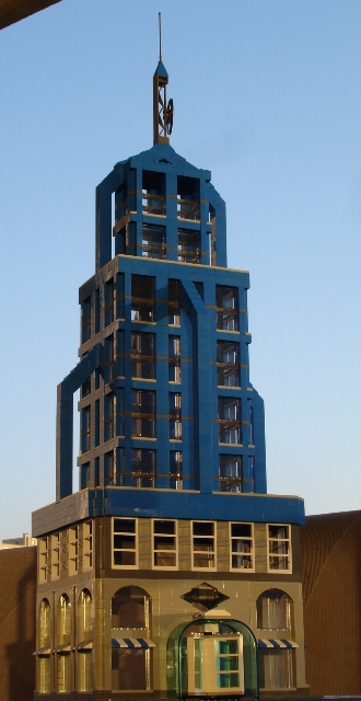
Into the Blue Morning Sky

Courtesy Skyscraper by jorgereis and PLUG
Found this on Brickshelf today. Portugal LEGO User's Group (PLUG) built this amazing looking skyscraper. What might be avoided in models for its all too colorful appearance, blue just excels in this model. The light playing off the shadows and the light gray give it a real nice look. Course it doesn't hurt to have some real sky in the background! Well done!

Tuesday, March 15, 2011

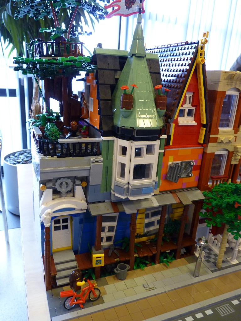
The Porch is Broken

Courtesy LowLUG by mockingbird
Members of LowLUG got together and built some stuff for their March 13th meeting. One thing that stood out was this crazy/cartoonish house that's just fun to look at. Seriously, what's not to like?

Sunday, March 13, 2011

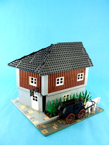
A Pint or Two, Please!

Courtesy Cat's Eye Tavern by Auric
A simple little tavern that features some great angles. Head on over to the Jolly Roger Contest II over at ForbiddenCove.com.

Saturday, March 12, 2011

On a More Dangerous Note....

Courtesy Prison by evildead
There's a new prison in town! And according to the pictures, it's not that well guarded. I guess Jail Breaker Joe has some hired help now....

Great job on this model! Very prison like.You'll break out laughing seeing some of these escape "attempts!"

PennLUG Uses Trains

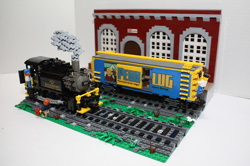
Not a lot of buildings in this one, but I still the like the classic look to this model. The red building in the background is the perfect backdrop for a scene like this. Very well photographed! (Shout out to Classic-Town.net for posting this!)

Friday, March 11, 2011

Convent Columns of Cheese

The columns on this thing are fantastic, not to mention the cheese slopes plastered all over the place. Great design and very well thought out!

I would also like to wish everyone in Japan the best. Our thoughts go out to you.

Thursday, March 10, 2011

So You Like Windows?

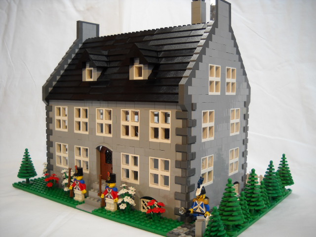
Courtesy Port Royal Governor House by  Peterdeyeule
A nice simple building. I really like the use of those small 1x2x2 windows to create that classic window effect. Be sure to see his "pillage the village" entry too!

NEWS - 2010 Profit for LEGO

Well, I meant to post this awhile ago, but anyways, I am very happy to announce that LEGO has posted a 65% increase in profit from the year before and is now the 4th largest toy maker. I can't help but wonder if a majority of that is due to the explosion (at least that's how I see it) of online activity through various sites such as our very own Brick Town Talk, the LEGO groups on Flickr, Brickshelf, or the countless other LEGO related sites.

What are your thoughts? Leave a comment!

Read the full article over at Yahoo!

Tuesday, March 8, 2011

Hey, look! LEGO!

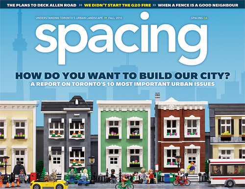
I meant to post this when I first saw it, but since Spacing Magazine is a company, I had to request their permission and until only today did I get the OK to post it. This is pretty out of date, but regardless, I like seeing LEGO make its way into the media spotlight.

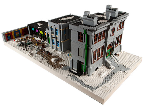
Silent School Halls

Now this is unique. I don't see many school building creations, but this is absolutely fantastic. I love the turn of the century stone school building and the little wing running off to the side. The playground is also a great addition. I could go on forever about this, so check out the pictures for yourself!

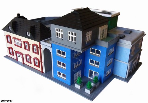
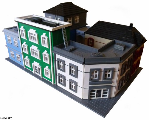
A City Block

As much as I like the individual buildings we usually think about when talking about modular building, I'm beginning to think that complete city blocks are sometimes more appropriate for group layouts. There's something special about being able to point to a coherent section and say "I built all of that". Take this block, for example:

Photos courtesy of LUKY'S 1987 LEGO CREATIONS's flickr photostream

That's two opposite corners of the same city block. 

Sunday, March 6, 2011

I'm Allergic to Flowers

Courtesy Rosa's Flower Shop by Roos van Eekelen
A great little house that would fit in with LEGO's current line of creator sets. I think what makes this work for me is that little greenhouse attached to the side. So cool. Be sure to check out the interior too!

We All Need Robot Insurance

This was posted quite awhile ago on Flickr, but up until recently did I finally got around to posting it. Anyways, please check this building out. The amount of facade techniques on this thing is enough to speak for itself.

As it says in Rob's description, Old Glory Insurance was the first insurance company to offer insurance against robot attacks. I never knew this. I've always just thought of it just as a joke, partly due to the Saturday Night Live skit (who Rob so graciously pays tribute to.)

Hide your medicine!

A Little Smaller Now

Courtesy 2011 Tokyo, Japan by TN-FACTORY
I like the look of this. I'm not sure if it's very safe to have a train that close to a building, but hey, who cares? It's a good little vignette. 

Saturday, March 5, 2011

Now Just Build It!

Courtesy Town Build by ericblacky
I normally don't post "digital" creations on here, but this was just too good to pass up. I really hope this gets built at some point. That dark red building and stone walkway that loops up around behind it is very cool. It's a nice little neighborhood scene. Great job!

Times Gone By

The Central Fire Station in Rochester, Minnesota was built in 1898 and used all the way up until 1930. Unfortunately it was torn down, but this incredible model by (RTN LNA) keeps the building alive in both spirit and design. Truly an incredible structure. Check out his MOCpages for more pictures and a comparison to the real building. Hope you all enjoy it!

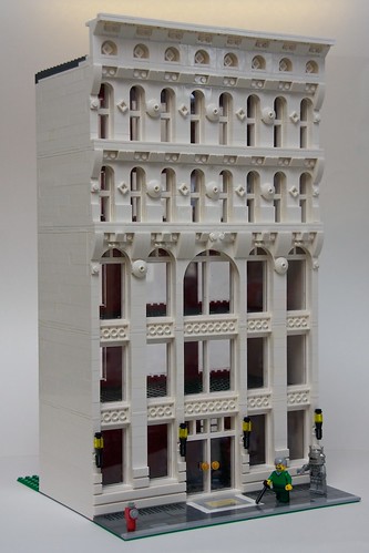
Going Old School

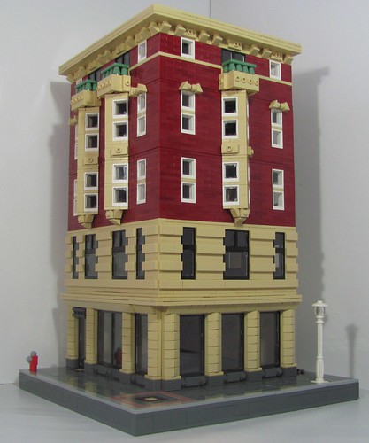
After a little break this week, Brick Town Talk finally returns with this terrific high rise building by Shuppiluliumas. The architecture and design on this structure is phenomenal; not too detailed, so as to take away from the original look but detailed enough to come across as a real building. My favorite part of this is  probably the tan bay windows shooting up from the third floor to the cornice. It has a very appealing look to it. Check out the inspirational building for a side-by-side comparison!