Monday, February 28, 2011

Enjoy the Bread!

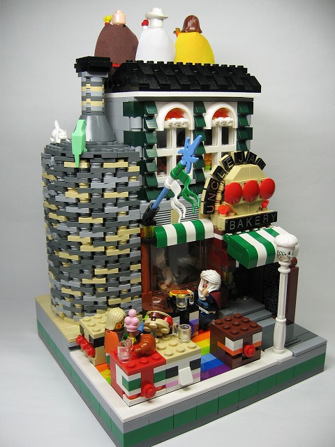
Courtesy Bakery by kishithi
An awesome little bakery with some terrific stonework. I love how everything is just kind of smashed together into one tiny space. It works perfectly for this model.

Saturday, February 26, 2011

Translate It!

I'm not sure what this site looks like internationally....but I put a little translate tool on the right for your convenience. Hope it works out well!

Chris

Here We Stand in Carentan

Courtesy Carentan by Brian Lyles
I guess modern buildings aren't just his only expertise. These incredibly detailed models by Brian Lyles have that nice French styling to them and the colors are a perfect match. Too bad they're blown to pieces, but honestly, that's what makes this layout come together. Making something look like it's damaged or destroyed can be a tough thing to pull off with LEGO. It is hard to find that balancing point, but obviously that doesn't apply here! These are wonderful. Great job!

Thursday, February 24, 2011

A Trip to the Downtown

Courtesy Chicago Style by Dark-Alamez
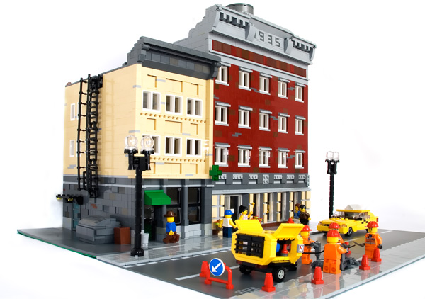
The look of this little street section is just fantastic. The designs are nice and simple, and I really like the colors as well, especially with that fire escape there on the side of the tan building. It has a awesome "downtown" feeling to the whole thing, so check it out! I think you'll like it!

Monday, February 21, 2011

A Humbled Modular

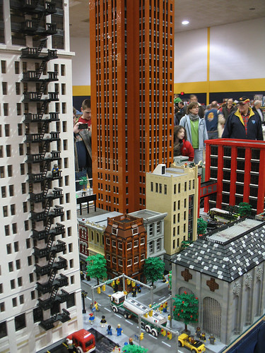
The Michigan LEGO Train Club at Ann Arbor Train Show was held this past Sunday, February 20, 2011 in Saline, Michigan. The models were created by members of the MichLTC, and as one can see, they were huge. I really like this shot because it captures the enormity behind the models. The small brown building in the middle would be quite large compared to Cafe Corner or Green Grocer, but in fact is relatively minuscule in this layout. So cool! For more pictures, visit DecoJim's photostream and for future MichLTC events and times, visit their website.

Michigan LEGO Train Club at Ann Arbor Train Show, Saline Michigan, February 20, 2011
Courtesy Ann Arbor Train Show by DecoJim

Sunday, February 20, 2011

The Decay of Days

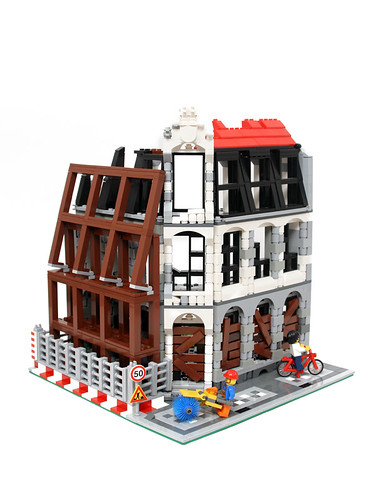
A very interesting take on neglect and renovation. The set up of colors really grabs the eye's attention. I especially like the fencing and boarded up windows. Nice job on this one!

Saturday, February 19, 2011

Through a Bird's Eye

Courtesy LEGO World Kobenhavn 2011by Matija Grguric (Photo© Klementina Kos)
Well...what's your favorite detail? It could be the old cars, the cobblestone streets, or the buildings. Maybe its something else? Whatever it may be, this layout really brings out the best in LEGO. 
 
LEGO World Kobenhavn 2011
Courtesy LEGO World Kobenhavn 2011by Matija Grguric (Photo© Klementina Kos)
Don't forget to check out the row of houses!

I Live on Land and on Sea

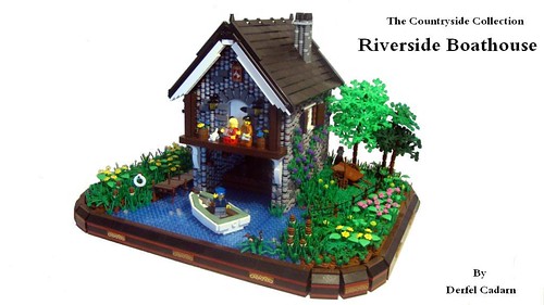
The number of 1x1 rounds used in this model is astounding. They capture that rocky texture very well while contrasting nicely with the surrounding greenery white "woodwork." Who can't like that boat either? Awesome job on this!

Sunday, February 13, 2011

And On It Continues!

Courtesy Ralph Lauren by Jared Chan
He's just cranking out these clothing stores. The latest is a Ralph Lauren outlet....so I'll just let the pictures speak for themselves. Awesome job on this! It reminds me how I really need to obtain some dark orange one of these days.

The Hustle and Bustle

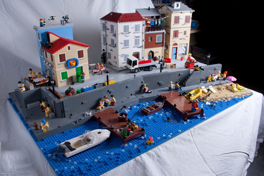
Courtesy Italy by vrabec
Hopping way across the world,  Brick Town Talk stumbles over another incredible layout, this time of a small village in Italy. It features everything. A wheelbarrow, a kid playing with a toy helicopter, building cutaways, and a baby stroller are just a few among the many details that are found in every nook and cranny of this layout.

Check out that wall detailing! You really can't get much better than this. Keep up the excellent work, vrabec!

Saturday, February 12, 2011

NEWS - Enter Hasbro


It appears Hasbro is attempting to butt into the building set industry with a new Transformer line set to be released this fall. The new blocks will be compatible with LEGO and MBs. Here's a little excerpt from the Chicago Tribune.

"Kre-O, launching in the fall, is intended to grab part of the booming construction set business that Lego dominates. While total U.S. toy revenue rose 2 percent to $21.87 billion in 2010, according to the NPD Group, building set sales jumped 13 percent."

Full story can be found on the Chicago Tribune website.

What can this mean for LEGO? Perhaps lower prices, maybe? Thoughts and comments welcome!

Waxed in History

Courtesy Wax Museum by shutinc
Remember that WIP museum post we had a little while back? Well, it's done, and it's nothing less than exceptional. The level of detail on this thing is extraordinary. The pillars add that sense of dominance to the building with those large white windows contrasting perfectly with the tan. I love the design of this thing. Great work all around!

Thursday, February 10, 2011

Stay at the Valencia Hotel!

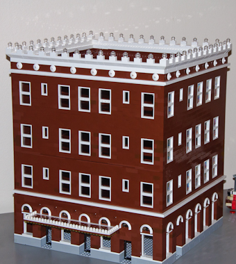
Courtesy Valencia Hotel by rocketbat
A spectacular rendition of the Valencia Hotel found in Anaheim, California. The thing that I like most about this structure is the turn of the century feel to it. The rows of repeating windows, cornice detailing, and the white clashing with the brown are just right for a building like this. Great job on this!

Wednesday, February 9, 2011

"I've Got a Gal in Kalamazoo!"

Well, not really. It's actually a really great song by Glenn Miller, check it out sometime! But more importantly, check out this terrific layout of Kalamazoo, Michigan by Flickr member statlerhotel / d k. Not only does it feature the Kalamazoo County Courthouse, but also numerous other downtown buildings, such as the Grande Ballroom (see below.)

grande ballroom
Great job on this. This is why LEGO is so awesome.

Monday, February 7, 2011

That's a Skinny House

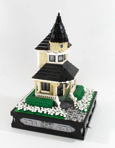
Courtesy Victorian House by L D M
Skinny but sweet. The way the porch wraps around the house and the turret design are top notch. I hope this gets expanded! It reminds me of the big old houses I see up here in Michigan from the lumber days.

Sunday, February 6, 2011

Leave it to the Building

The level of detail on this model is spectacular. The logo on one side and the store name and mannequins on the other really catches the real-life feel of a clothing store. However, the best aspect for me in this build is probably the windows. The switch from the small window on the left with its own protruding roof detail to the larger, more prominent windows on the right makes the design so much better. The colors work, the design works, and the name works. What's not to love?

Update - 2/6/11

Hey folks!

It's not too easy finding interesting posts from earlier years, so I spent a good part of this morning indexing (adding labels to) posts. I got from December 2007 down through October 2007. It was about 50 or so posts (and I'm very tired now!) Also, be sure to check out the Categories menu to the left for the new "Layouts" and "Other" pages. More posts can now be found in all categories. I'm not even close to being done, but I'll keep at it. In the mean time, enjoy the better browsing experience!

Edit: Also added links to the Modular Building Wikipedia Page and Klocki.

Leave a comment if you wish!

Saturday, February 5, 2011

Now that's a rock wall!

Courtesy The Wall by Schfio Factory
By far the best brick built rock wall I have ever seen. The houses are also a great, each with their own distinctive style.

Friday, February 4, 2011

Creator Tips


Courtesy Creator Tips by cre84fun.

I found this while looking around on YouTube. They might come in handy at some point, so check them out!

It's Pretty Fancy....

Courtesy 1913 by Noro
A unique approach to the modular standard. The variation in details is superb, especially those vertical gray tiles which break up the white really well. The car is a great touch too. Very turn-of-the-centuryish if I do say so myself! Great job!

Crowded Coolness

Courtesy Streets of Jaffa by Paul Vermeesch
I really like the simplicity of this model. The clothesline, little kiosk, and variation in brick design really make this model come together. Very nice, Paul!

Wednesday, February 2, 2011

Interview with L.G. Orlando

Blue_Barbershop_1
Barbershop
We all know L.G. Orlando's models. From his Ultimate LEGO City Hospital to his Toys R Us, its guaranteed that something amazing will be built with extraordinary detail and precision. So today, I asked him a few questions related to his hobby, and here's what he had to say:

Brick Town Talk - When did you first start building with LEGO?

L.G Orlando - I was very young when my dad introduced me to Lego back in the 80’s. My first set was 6073 Knights Castle. I still have a lot of the pieces and minifig parts, all faded of course.

BTT - Did you go along with the Cafe Corner from the beginning, or did it take awhile for you to catch on?

L.G. - Café Corner was an instant hit with me. It changed my building habits overnight. I couldn’t get enough of its potential with great design and color. It was the first Lego set that I ever bought multiples of.

BTT - I notice that it says you're a Structural Engineer. Do you feel like that has had a major effect on the way you construct your models?

Dream Street
Dream Street
L.G. - Lego certainly had a huge impact on my choice to be an engineer. It’s funny to me that I do apply a great deal of structural planning into my models. I usually never build from scratch, I always have a function for a MOC (e.g. Corner House with veranda or inner city post office with rear loading dock). I test the architectural pieces first; like designing my windows and entrances to make sure they function and look interesting; then I build the frame around those parts. I plan color elements carefully I use tons of plates in my designs so If I build in orange then I will have to make sure I can get 1 x 1 or 1 x 2 orange plates. There’s nothing worse for me than trying to build your way out of a poorly organized design.

BTT - As a builder, what pieces or color would you like to see LEGO make more available?

L.G. - I’d like to see LEGO release a pro designer/ architect pack of basic brick shapes and plates in the darks, sands and lights of the primary colors. I’d buy buckets of those! My wish list of parts is windows that are curved and would fit in the larger arches and as set of 1 x 1 or 2 x 2 corner brackets.

BTT - Is there any special organizing method that helps you build more efficiently?

L.G. - I sort by color, then bricks and large plates. I keep all basic bricks together no matter what size separated by color. I do the same with plates but for long 2 x N plates, I stack these into a large set that I use to peel away plates as needed.. I save special use parts in bulk that I use frequently like modified headlight bricks, jumpers plates and cheese in their respective families in large trays. All of the other pieces I just leave in a large tubs by color, it’s pretty easy to find what I’m looking for and sometimes I get lucky by building a neat table scrap idea when I find a part I didn’t expect.

BTT
- Are you a Bricklink or Pick A Brick kind of guy?

Sky Victorian, modular house
Sky Victorian
L.G. - I was a big online Pick A Brick guy when the service first started. It helped me really expand my custom builds quickly. Prices increased dramatically some years ago and I went over to bricklink. I wasn’t a fan of used parts but over the years I’ve gotten better at picking great new parts from reputable sellers at reasonable prices. I still use PAB for tiles, rare modified parts and minifigure accessories quite frequently. I save part numbers on a scratch list I keep along with a large baseplate of needed or wanted parts that hangs on my wall where I build.

BTT - What sets would you like to see LEGO produce for the Modular Building series?

L.G. - We could use a nice library or municipal building (town hall, bank, train station) that utilizes some Greek revival architectural elements. You see this kind of stuff everyday in real life and I think this type of realism in café corner buildings really appeals to fans of the series.

BTT - Where do you draw your inspiration from?

L.G. - “The old world in the big city”. I love older buildings that still maintain their charm even in a big city like New York or San Francisco. Back when older buildings were being constructed, builders put a lot of personality in the masonry, windows and entrances. I think Jamie Beard did a great job with drawing on such inspiration too. I see Victorian era San Francisco in the Green Grocer and the early art deco Chicago/New York skyscraper age in the Grand Emporium.

BTT - Are you working on any models at the moment? (If you'd rather keep it a secret, I understand!)

L.G. - I’ve been working on what I call a “Super Stack” modular for the past 5 months or so. The challenge this time is to build a realistic city-scape that functions as a transitional city center that unifies CC scale with the smaller minifig-playscale city corner type buildings. The hard part is I don’t want to eat up a lot of horizontal space like I did with the hospital I built a few years back, so it will only occupy a 32 x 32 baseplate which means I have to plan smart for a nice vertical output. I hope to have it finished before the release of the next official CC modular.

I hoped everyone enjoyed this interview! Please leave a thought or comment below.
Renaissance Revival Shop

Courtesy Renaissance Revival Shop by Danny Budd
A great use of pillars and arches in this model, all tied together with a very detailed cornice. Also be sure to check out a larger layout of his. I wish I had that many pieces!

Another Church!

Courtesy Church by luclego
The really steep roof is probably my favorite part of this model. It has a very well thought out look and carries across that elegance and style of a real church.Nice job on this one.