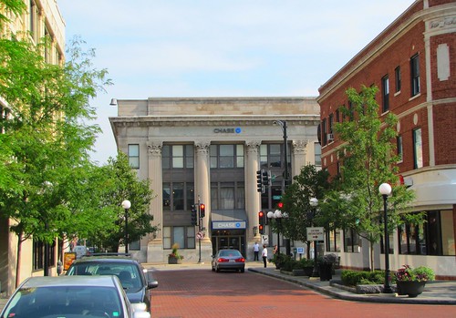
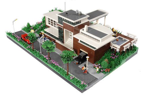
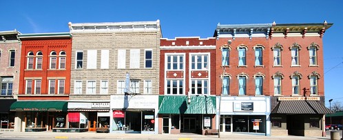
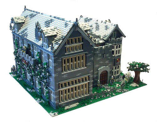
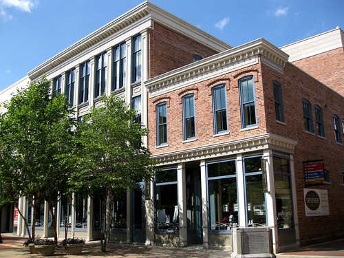
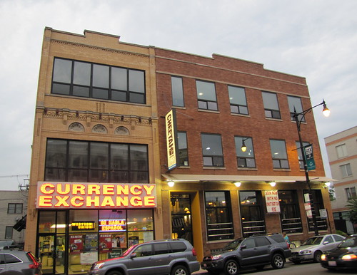
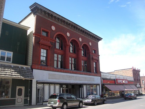
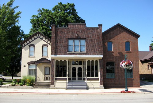
Courtesy Downtown Oak Park by Eridony.
Have a Happy New Years everyone!
Friday, December 31, 2010
Review of 9348
I was lucky enough to buy some LEGO with one day of the year left. I hoped to get Diagon Alley. Sadly the last one had sold out in the morning. I managed to purchase the amazing Atlantis Temple (which I shall build later today), 20 Series 3 Collectable Minifigures (12/16!!! - Not bad - sooooo many sumos!), and 9348 Community Minifigure Set. Enjoy the review.
Set Number: 9348
Name: Community Minifigure Set
Theme: Education / Dacta
Year of Release: 2011
Pieces: 256
Minifigs: 21
Price: £39.99
Box Art

The Contents of the Box
There are five bags. The set does not contain instructions - you have to guess from the box. There is also no inventory.
There are five bags. The set does not contain instructions - you have to guess from the box. There is also no inventory.
 The following pictures show the content of the bags. The first picture shows the minifigure heads. The males are all the same as are the females although they have a revesible head so that they can be happy or annoyed. The second picture shows some fantastic pieces that are available in other sets, however, its fantastic they are all here together in one place. The fourth and fifth pictures show the pieces (there are no stickers). The sixth picture shows the left overs.
 Finally here is a picture of some other minifigures you can make with the pieces.
I didn't take any pictures of the completed set because the images on the back of the box are so good - I couldn't top that.
Conclusion
This is definately a must have set for any City fan. The best bit about the set is getting the new pieces - crow bar, burglar's sack, printed dog, new colour cat - without having to buy lots of different sets. The laptop was a big bonus too as I didn't have one of those. It is good to see a balance of male and female characters and to see them represented doing non-stereotypical things (especially in an education set). I would give this set 9/10. The only thing I would suggest to improve it is having a greater variety in facial expressions.
Comments gratefully received.
Thursday, December 30, 2010
Huis Ter Dijk
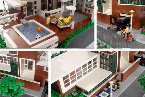 |
And yet another incredible house by Flickr user Nieks G. for the 2010 Brick Architect Contest. I'm astounded by some of the entries we've seen for this contest, so keep it up everyone!
Courtesy Huis Ter Dijk by Nieks G.
Tuesday, December 28, 2010
Toys R Us
And here we go again! Brian Lyles churns out another amazing outlet store, this time a Toys R Us. It has a fully detailed interior, a delivery truck, and one awesome giraffe. The facade on the building uses an interesting technique of a wall of windows that ends short of the cornice. The design is well thought out, and looks like it should be right there on the corner of a big city. Great job on this one, Mr. Lyles!
 |
Oh, and be sure to check out his new site, Brick City Depot!
Courtesy Toys R Us by Brian Lyles.
Monday, December 27, 2010
Branching Off the Cafe Corner Theme
LEGO obviously has had much success with the Cafe Corner line. Although LEGO is considered a "toy", the recent Cafe Corner line has appealed to many AFOLs, mainly due to the new building techniques, massive amount of pieces, and realistic architectural designs. So, what's next?
Architectural Themes and Sub Themes
Now that the line has proven its success, LEGO should consider branching off into themes and sub-themes based on particular architectural styles. We have already slightly seen this with the American turn-of-the-century styles of the Fire Brigade and Grand Emporium sets, compared to the more lavishly decorated European styles of Cafe Corner, Market Street, and Green Grocer. Nevertheless, it could be expanded even more.
Examples of Architecture Styles
Here are a couple ideas of what I mean:
Themes
- Houses
- Farms
- Downtowns
- Marinas/Harbors
Sub-Themes
- Asian
- European
- 1800s American Gold Rush Era
- Mexican/South American
- African/Mediterranean
Maintaining the Standard
Regardless of the chosen architectural style, the standard must be kept as with the original modular buildings; and that is the pin hole connections, the sidewalk, and the modularity of rearranging the floors and roofs.
How should they be introduced?
Every six months (or however long it may take), LEGO would release a certain number of sets based on different regions of the world all related in some way or another. For example, let's say in the first half of 2013, they release a series of small houses; one Asian styled, another European styled, another Mediterranean, and so forth. The second half could be a release of downtown or town square buildings, each from a particular region. The sets however, will have to be much smaller than their original counterparts if this were to work.
The line of sub-themes could be placed under a names such "Modular Farming - European - Barn" or Modular Housing - American- Two Story Home" to distinguish from one another and create a catalog of sets that could easily be viewed and purchased based on need or want.
Possible Problems
- It will impede on the current town and city theme
- It will cost a lot of money to introduce a new theme
- It will be focused mainly on older fans of LEGO, and not kids
- How to represent different cultures, countries, and regions
I would love to hear everyone's thought on the matter. I've been thinking about this idea for awhile now, so I finally decided to post something on it and see what everyone thinks, so please, post a comment, question, or another suggestion about the idea.
Sunday, December 26, 2010
Saturday, December 25, 2010
Family Home
Can you say ornate? This build by Flickr user LegoManiac - LEGO 13 is a terrific model of a immensely detailed home. It was built for the 2010 Brick Architect Contest over at Flickr. I recommend checking the submissions out, it has some terrific entries which should pave the way for some tough judging!
Courtesy Family Home by LegoManiac - LEGO 13.
Friday, December 24, 2010
Happy Holidays
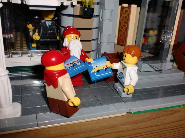 |
I saw this today on brickshelf in freeedrik's gallery. Made me feel Christmassy. I hope you all have a good one whatever you're doing.
Thursday, December 23, 2010
Gray Castle
There's some amazing architectural detail in this model, from the ground right on through to the roof. However, I would really like to know the cost estimate on a thing like this! The entire wall is made by a bunch of 1x2s by the looks of it. Keep up the great work!
Courtesy Castle by Tavernellos.
Courtesy Castle by Tavernellos.
Sunday, December 19, 2010
Modern Strip Mall
 |
Well, I had a feeling this would happen. I post the collage picture, and BOOM! I stumble upon another one of Brian Lyles awesome creations, a modern strip mall. It's an amazing little series of buildings with rarely used colors such as orange, sky blue, and lime green. Each even have their own interiors. Nevertheless, I think what I like most about this is the tan-brick pillars for each store, very nice touch, and keep it up Brian!
Courtesy Modern Strip Mall by Brian Lyles.
American Harbour Diorama
 |
2010 - Year In Review
This year has been loaded with amazing creations, and we here at Brick Town Talk can not thank you, as the readers, viewers, and builders, enough for contributing your time and energy into cranking out terrific MOCs. As a little gift, I made a collage of some of the MOCs seen throughout the year here on Brick Town Talk.
 | ||
| (Thank you, ShapeCollage.com!) |
Post a comment or two regarding your thoughts on how the year went!
Saturday, December 18, 2010
Rødovre Townhouse
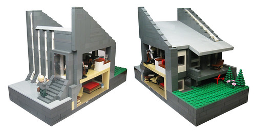
An incredible build, and quite unorthodox compared to those we see from across Flickr and other sites. This townhouse, based off a building in a Danish town, features a great cross-sectional view of the interior— with furniture and all. Check out the interior rooms for more great building techniques!
Courtesy Rødovre Townhouse by John.
Tuesday, December 14, 2010
Monday, December 13, 2010
Roswell Saloon
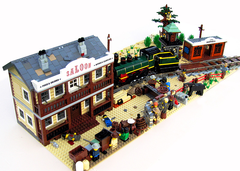 |
Courtesy Roswell Saloon by tacvud.
Sunday, December 12, 2010
Modular Church
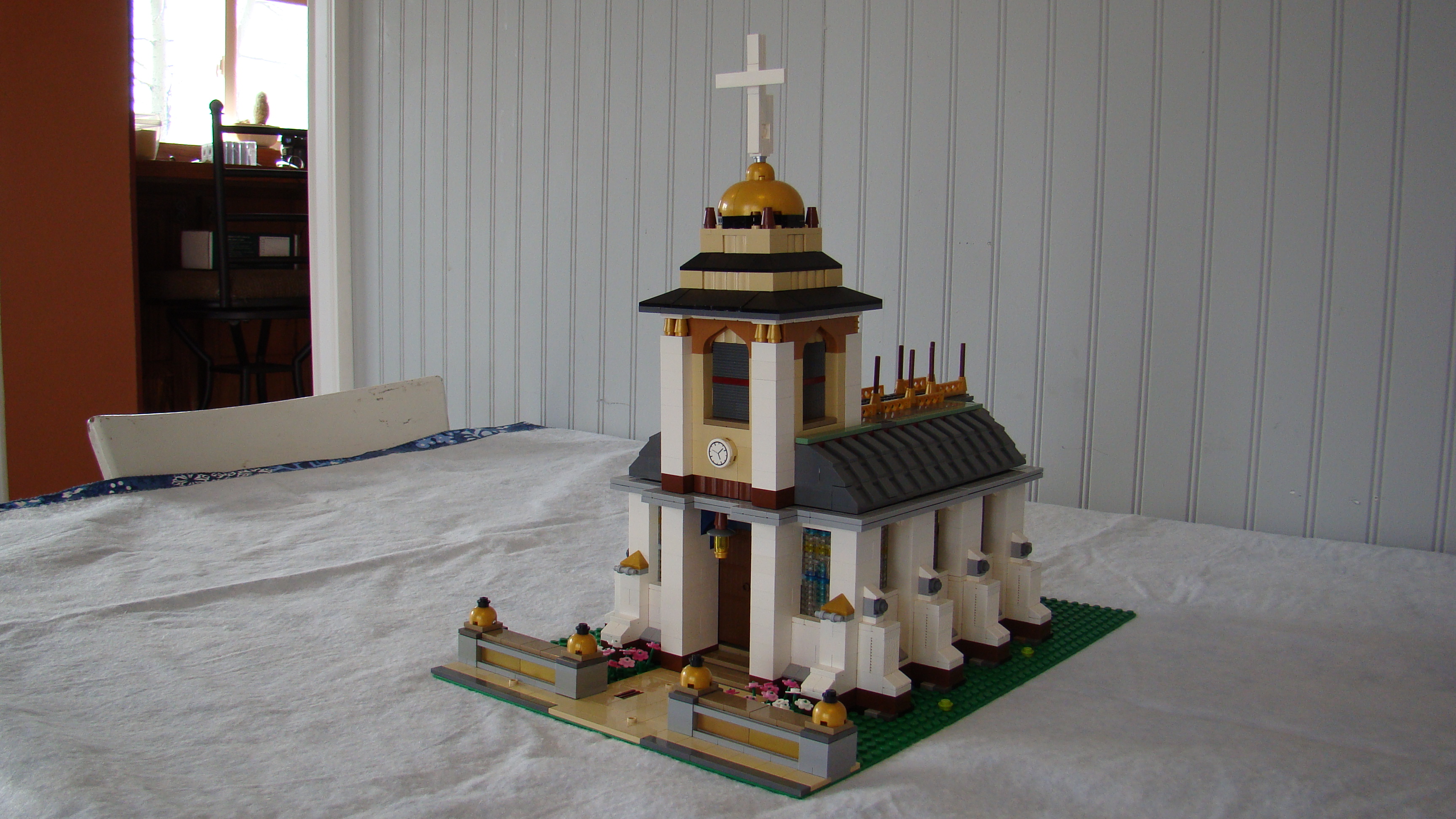 |
This church was designed by ktanger. I like the addition of the Series 2 Minifigures. I wonder what the service is about?
Saturday, December 11, 2010
Farm House
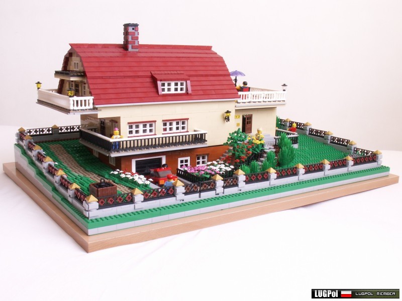 |
LUGPol members always crank out something terrific. I had a difficult time figuring out what the main picture for this model should be. Every photo is expertly taken and each offers its own unique view with an insurmountable amount of detail hiding behind every corner. This farm house (mansion?) is just spectacular. The red gambrel roof and how the entire structure is sort of "sunken" into the ground points to the fact that this could have been a barn at one point (at least that's how I see it), but the additions such as the porch and garage make for an incredible design.
And this is just the outside....so take a look at all the interior shots too!
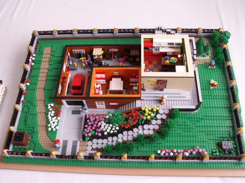 |
A truly incredible model. A massive amount of pieces and time went into this, and a massive model was born. Awesome job here!
Courtesy Domek Letniskowy 96 x 64 by maciejer.
Friday, December 10, 2010
Friday, December 3, 2010
Industrial Building
 |
There's something about factories and industrial buildings that I just find intriguing. I guess it is just all the different components that go into making one work or just the shear power that seems to resonate from them. Perhaps it is the culmination of raw materials, logistics, and the facility itself that go into making the products that I find so interesting. Regardless, I don't see many factory models too often, so this caught my eye immediately. What I like best about this particular model is the restriction to a simple three-color scheme meshed with varying heights in the structure itself. It turned out remarkably well. Great job Luky1987!
Courtesy Industrial Building by Luky1987.
Tuesday, November 30, 2010
Winter Village Train Station
 |
Courtesy Winter Village Train Station by Brian Lyles.
P.S. Also check out his new website, Brick City Depot.
Friday, November 26, 2010
Edificio
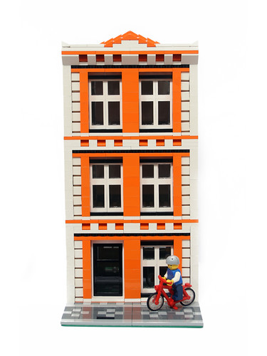
Bright orange is hard to use in LEGO structures. Sometimes it's just too over- powering and the color just takes away from the model as a whole. However, this building by Naneto, a Portuguese AFOL, is certainly an exception. By blending it with the white bricks and the black outlines created by the windows, the orange enhances the building's look and contributes to a very pleasing aesthetic design. Good work!
Courtesy Edificio by Naneto.
Courtesy Edificio by Naneto.
Thursday, November 25, 2010
White Building
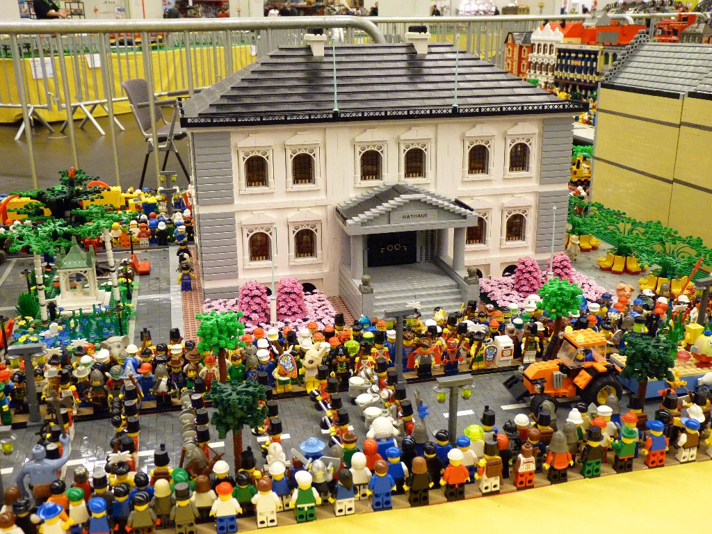 | |
A nicely built structure with a good design and color choice. It has a terrific representation of European architecture. View the entire folder to see more great buildings!
Courtesy Carnival Parade by Mockingbird.
Tuesday, November 23, 2010
Sunday, November 21, 2010
Saturday, November 20, 2010
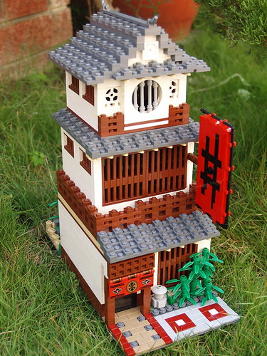
Japanese House
This was actually a coincidence, but when I stumbled upon this building I couldn't help but post it here. This is an amazing creation, and best yet, it has a superb interior to go along with it. Who knew a musket could be such a good railing?
Courtesy 20101120 by midnightcat.
Thursday, November 18, 2010
Japanese Restaurant
His work's been blogged before, and for a good reason. This LEGO model is a tremendous rendition of Japanese architecture. The brown, vertical beams look terrific as well as that finely sloped gray tiled roof.
Courtesy Japanese Restaurant by rack911.
Monday, November 15, 2010
Prairie Style House
 |
Very intriguing build. The wall along the sidewalk really catches the eye, as do the red and tan conflicting with each other. However, I think my favorite part is the glass-balcony walk out, great idea there. Keep up the great work!
Courtesy Prairie Style House by Jameson42.
Sunday, November 14, 2010
Inspiration of the Day - 11/14/10
American Printing Company, Mill #7, in Fall River Massachusetts.
Courtesy Anawan Street by Marcfoto.
Courtesy Anawan Street by Marcfoto.
Thursday, November 11, 2010
Inspiration of the Day - 11/11/10
Happy Armistice Day! Brick Town Talk thanks all veterans and their families who battled it through thick and thin. We salute you.
Courtesy Downtown Caluemt, MI by Myself.
Wednesday, November 10, 2010
Inspiration of the Day - 11/10/10
I'm just trying this out to see how it goes. For those of you frustrated in not knowing what to build, I will try to post daily images of real life buildings to provide some ideas and inspiration.
Leave your thoughts and comments on the idea if you wish!
Courtesy Zeeland Historical Museum by Eridony.
Tuesday, November 9, 2010
Mr. Wong's Curio Shop
Mr. Wong's Curio Shop, originally uploaded by Jameson42.
A very nice model to say the least. The horizontal black rectangle with the yellow dots really stands out against the tan wall. The general black outline of the whole structure really brings everything into focus for me. Very cool!
Sunday, November 7, 2010
The Building Process
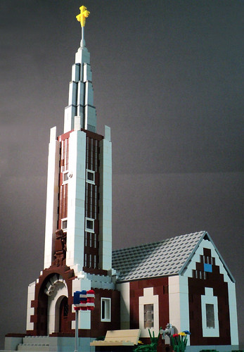 I don't know about you, but whenever I build something, it is usually based off something I saw while on a trip or something that's been eating away at my conscious for awhile. For example, after visiting Calumet, in Michigan's Upper Peninsula, I was inspired to build a church. What inspires you to build?
And then there are the problems faced while building. It can start at any moment. Not sure what to build, how to build it, the lack of pieces, or the sudden change in mind. What problems do you face? How do you fix them?
I would just like to hear your thoughts and comments on the matter.
Hope to hear from you!
Friday, November 5, 2010
NEWS - LEGO Sales Up 20%
Just caught this on the CBS evening news today. LEGO is "building up its workforce by 10%" and sales are up 20%. Sounds like great news, hopefully they can keep this up through the holiday season. Thoughts and comments always appreciated!
Click here for the full length video. Sunday, October 31, 2010
Abundance of Dark Orange
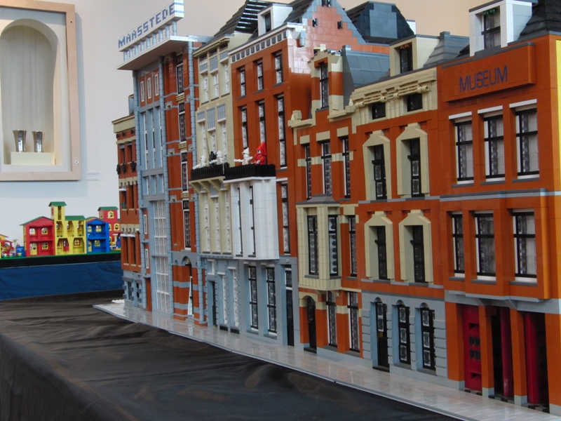 |
| Courtesy cheops from Brickshelf |
A testimonial to why Dark Orange is such an awesome color, and yet, why is it seemingly impossible to obtain in large quantities (LUGs are an exception)? Take this as a hint, LEGO. People want this color, and it can do wonders for a model.
It's far too expensive on Bricklink and Pick a Brick does not even offer it. I understand that it might be a bit more expensive to produce such a color (especially just for adults), but wouldn't it be more applicable to everyday models (sand/dirt, buildings, roads, terrain, etc.) compared to say, Bright Blue or Bright Yellowish Green?
So what do you as builders think? Leave a comment or thought if you wish.
Thursday, October 28, 2010
Cafe Corner Truck on Ebay
Thursday, October 21, 2010
Village
There is a thing about European architecture that sets it apart from others. Perhaps it is the squished buildings lining the streets, or the variances in design, but whatever it is, Flickr user psiaki sure managed to capture the look and feel of a small European village. Better yet, this isn't even "completed" yet! We all look forward to seeing where this one goes. Please get this project rolling, Mike!
Chili's Restaurant
 | |||
| Courtesy Brian Lyles from MOCpages |
I personally apologize for overlooking this, but to get to the point, this is why building in the Cafe Corner standard is so much fun. Anything can be built, and that's why Brian Lyles figured, "Why not a Chili's restaurant?" First off, the chili pepper is spectacular, along with its accompanying logo. The brickwork is superb and shows what one can do with an endless number of 1x2 plates. The building itself is well built too, with very nicely proportioned colors, like most modern buildings of today. There's a lot of building tips that can be used in this creation, so take heed and maybe you can incorporate them into your own model someday. Look forward to more, Brian!
Sunday, October 17, 2010
Classic Corner Kwik Stop
 |
I really enjoy the look of this model from MOCpages user, Alex Mac. The stonework really gives it that classic convenience store look and the dark red roof just works very well for the creation. All it needs is a huge flashy sign out front!

