Sunday, October 31, 2010

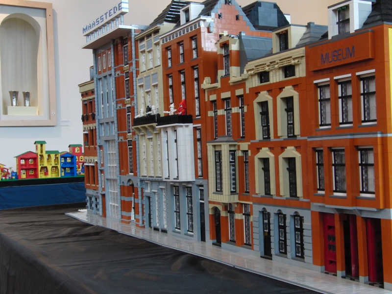
Abundance of Dark Orange

Courtesy cheops from Brickshelf

A testimonial to why Dark Orange is such an awesome color, and yet, why is it seemingly impossible to obtain in large quantities (LUGs are an exception)? Take this as a hint, LEGO. People want this color, and it can do wonders for a model.

It's far too expensive on Bricklink and Pick a Brick does not even offer it. I understand  that it might be a bit more expensive to produce such a color (especially just for adults), but wouldn't it be more applicable to everyday models (sand/dirt, buildings, roads, terrain, etc.) compared to say, Bright Blue or Bright Yellowish Green?

So what do you as builders think?  Leave a comment or thought if you wish.

Thursday, October 28, 2010

Cafe Corner Truck on Ebay


This beautiful creation could be yours. Its for sale on Ebay. I love the colours and the logo.

By brickbuilderspro

Thursday, October 21, 2010

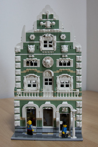
Village

Courtesy psiaki from Flickr
There is a thing about European architecture that sets it apart from others. Perhaps it is the squished buildings lining the streets, or the variances in design, but whatever it is, Flickr user psiaki sure managed to capture the look and feel of a small European village. Better yet, this isn't even "completed" yet! We all look forward to seeing where this one goes. Please get this project rolling, Mike!

Chili's Restaurant

Courtesy Brian Lyles from MOCpages


I personally apologize for overlooking this, but to get to the point, this is why building in the Cafe Corner standard is so much fun. Anything can be built, and that's why Brian Lyles figured, "Why not a Chili's restaurant?" First off, the chili pepper is spectacular, along with its accompanying logo. The brickwork is superb and shows what one can do with an endless number of 1x2 plates. The building itself is well built too, with very nicely proportioned colors, like most modern buildings of today. There's a lot of building tips that can be used in this creation, so take heed and maybe you can incorporate them into your own model someday. Look forward to more, Brian!

Sunday, October 17, 2010

Classic Corner Kwik Stop

I really enjoy the look of this model from MOCpages user, Alex Mac. The stonework really gives it that classic convenience store look and the dark red roof just works very well for the creation. All it needs is a huge flashy sign out front!

Friday, October 15, 2010

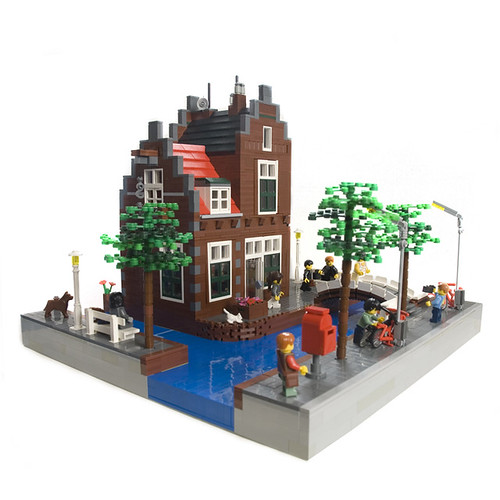
Dutch Canal House


Dutch Canal House, originally uploaded by Nieks G..
Creations like these are an instant inspiration to get back to building. It is a very visually pleasing and realistic creation, with details around every corner.Very cool!
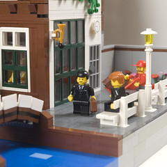
Dutch Canal House
...and don't let me forget the terrific photography!

Sunday, October 10, 2010

Halloween Street


Halloween Street 1, originally uploaded by notenoughbricks.
The never ending season of tricks and treats. Toil around with ghouls and ghosts, but make sure to enjoy the build the most!

Cheesy rhyme, buy seriously, this is a fantastic build. The much neglected orange is a superb addition to this creation. Very well thought out!

Thursday, October 7, 2010

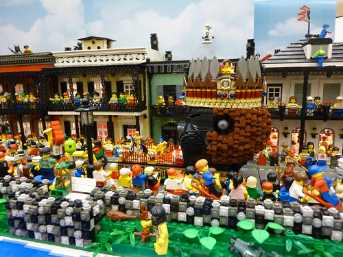
Mardi Gras Madness!

A new realm of building. I'm really loving those porches and rock wall.

Wednesday, October 6, 2010

Monday, October 4, 2010

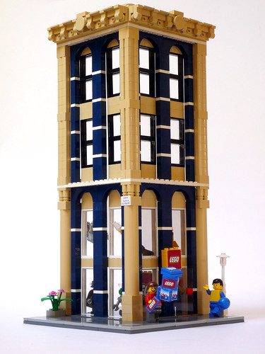
Corner Office Building


Frontal, originally uploaded by valgarise.
I love the simple, art deco feel to this, intentional or not. The colors match terrifically, and I'm really liking that cornice detailing up top. Hopefully this will spur builders into some skyscraper construction!

Mafia Shoot Out


I really like MOCs that tell a story. This one was created by Brickstud. It reminds me of old black and white films.

Sunday, October 3, 2010

NEWS - LEGO on CBS' Sunday Morning Show

Once again, LEGO makes the headlines!

Check out CBS' photo gallery on LEGO - Not Just Kid Stuff as they discuss the growing number AFOLs and the massively popular LEGO convention, Brick Fair. Not sure if there will be an accompanying video on it, but make sure to check it out!

EDIT: Here's the video! Click.

Chris

Saturday, October 2, 2010

STEAM - LEGO Exhibition Swindon

First let me say a huge thank you to the organizers for another fantastic day out. Some of the highlights were a speed build of Tower Bridge and The Town Hall that Jamie Berard designed as well as a completed version by my friend Darren and The unveiling of the brand new Diagon Alley set that was announced yesterday. The exhibition continues tomorrow so get down there if you can. P.S - To top the day off nicely I received my copy of LEGO Universe today.


New Gadgets!

Off to the left, you can find a new "stats" counter and a "top 5" of the most viewed posts, for your convenience. Please post any comments or thoughts!

Chris

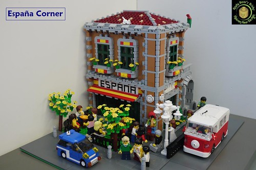
Spanish Corner

01, originally uploaded by andybear@hk.
A very nice, simple building with great colors and designs. The tree built with a bunch of flowers is a great idea and the dark tan just works perfectly with this build! I look forward to more!