Thursday, July 29, 2010
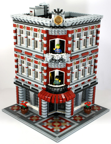
Dark Red Modular Love
It took two Fire Brigades, but it sure came out well. I especially like the columned windows on the sides, it makes for a very well made "turn of the century" look.
Wednesday, July 28, 2010
Super-Size Me Market Street
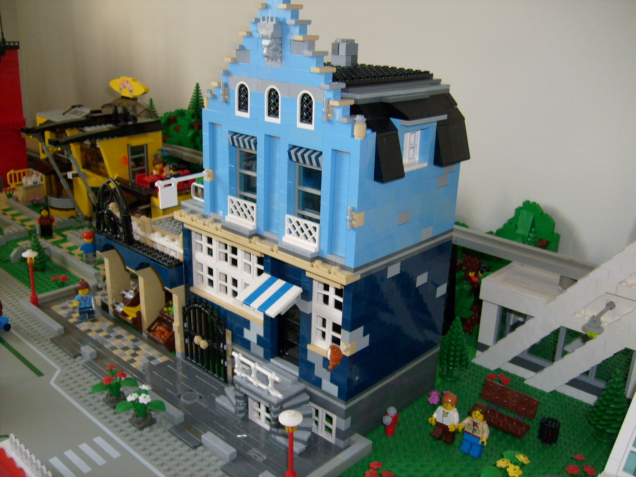 DenisM presents his own twist on some of the modular buildings. I really like the way you have incorporated the Fire Brigade design with a City fire station. Check them out here.
Tuesday, July 27, 2010
Church
I finally finished up my church yesterday and decided to take some pictures today. It used up practically my entire supply of basic brown bricks (which wasn't a lot in the first place), but I think it was worth it. There's no picture of the interior, as it's pretty bland, but I hope you all enjoy it!
At some point, I need to get a photo of all my buildings together....
For more pictures, just head on over to Flickr.
Sunday, July 25, 2010
Marcos Bessa's Models
 |
 |
I featured this one over at LMOTD on Saturday:
 |
 |
Saturday, July 24, 2010
Samba Van On The Beach
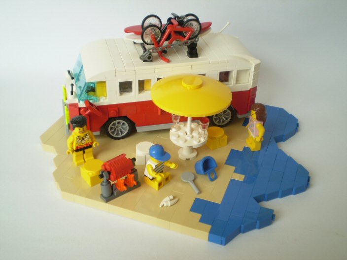 I'm loving the detail in this model. Makes me look forward to my holiday even more. Fantastic Richard03.
Tuesday, July 20, 2010
Sunday, July 18, 2010
Matijaville
Architectural genius Matija Grguric brings us this elegant train station and other town buildings in grand detail. Down to a shopping center and up to a skyscraper, everything's there. This is a true inspiration for anyone wanting to build something, so take heed and look through these magnificent creations.
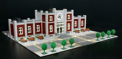 The incredible train station. Well positioned with a very imposing style.
Color variation is just excellent. Dark blue, dark red, light blue, light gray — it's all there.
...and then there's that awesome Honda billboard (closer image here). I really like how these two buildings just work together. The contrast is perfect.
Check out the whole town display over at Matija's Flickr photostream!
Saturday, July 17, 2010
Klocki-Zdroj 2010 by LUGPol
 The colours in this Street look really realistic. You can see more here. From pepik's gallery.
Thursday, July 15, 2010
LEGO House
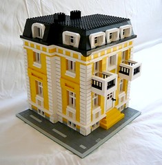 Yellow is a hard color to use in realistic buildings in my opinion, but Flickr user georgivar obviously had no trouble doing that. Added with the white brick corners and second story balconies, this building makes for a really nice European style structure. Great job on this one!
Saturday, July 10, 2010
The Cafe is Now an Embassy
There's been a lot of Cafe Corner mods over the years, many of them seem redundant and lack any unique concept whatsoever. Flickr user, Atom For Peace, however, is an exception. Take a gander at the new Legoland Embassy. As well as being a terrific idea all in itself, the MOC is just fun to look at. The "under construction" look came across very well, and the white stands out perfectly for a government embassy. Keep up the great builds, Atom!
Monday, July 5, 2010
Blue Bard's Weird Social Club
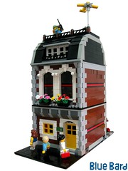
A great little building with two floors for the strange and funny. Visit the second floor for some music or hang out with the old lady and her cat on the first. Do this all while watching an RC plane on the roof and some gun sight adjustment for a dummy. Every city needs that "weird part of town", and Blue Bard addressed that issue first hand.
Saturday, July 3, 2010
19th Century Office Tower

Now this is what I'm talking about. MOCpages user Jonas James writes this:
And it works perfectly. Great building, can't wait to see more!
This design incorporates the use of light and dark contrasting to emphasize form and conceals roof structures with a decorative crowning parapet.
And it works perfectly. Great building, can't wait to see more!
Friday, July 2, 2010
Some Recent Flickr Finds
Some more goodies showing up lately on flickr:
from Bruno Vaiano's flickr photostream
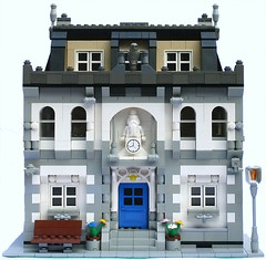
from 973 Praf / Toby Gentle's flickr photostream
For some more rural inspiration, check out this bridge and landscaping:
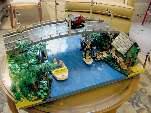
from yoderism2's flickr photostream
from Bruno Vaiano's flickr photostream

from 973 Praf / Toby Gentle's flickr photostream
For some more rural inspiration, check out this bridge and landscaping:

from yoderism2's flickr photostream
Thursday, July 1, 2010
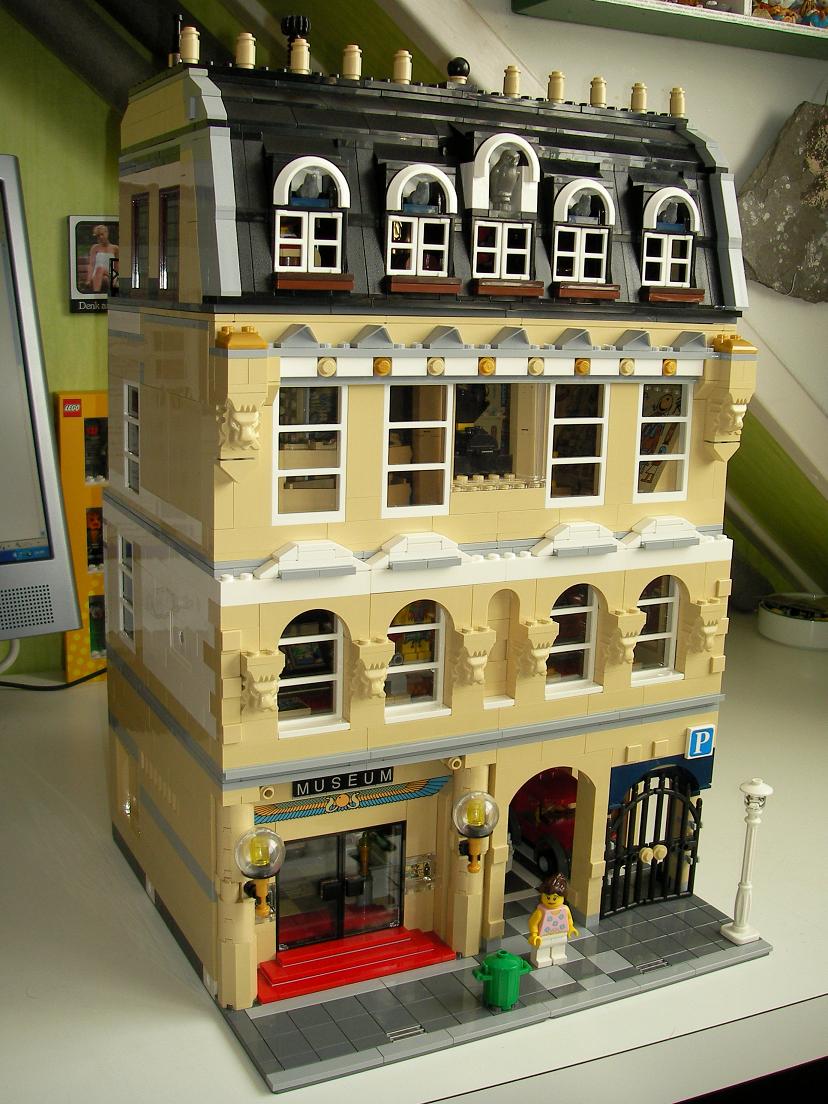
Museum of Antiquities
With a large imposing view, this museum brings up the good memories of Johnny Thunder as he ventured through the desert, jungle, and mountains. From expensive gold dinosaurs to walls lined with hieroglyphics, one will see the time taken to get every detail right. Just check out the glass showcases to get an idea. Great job all around, Atlas!

