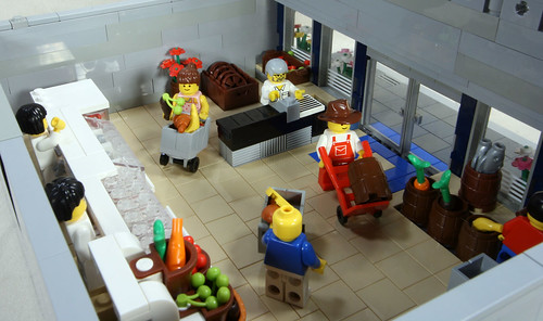
This crisp looking creation was created by ToT-LUG, over at Flickr, and features quite the interior. With a meat counter, check-out lane, and clean floor space, this MOC is simple, yet not over cluttered. My only recommendation is to clean up the front awning, as it looks a bit jagged. Nevertheless, keep the CC buildings coming!
A quick picture of that interior:


No comments:
Post a Comment
Leave a thought or comment!