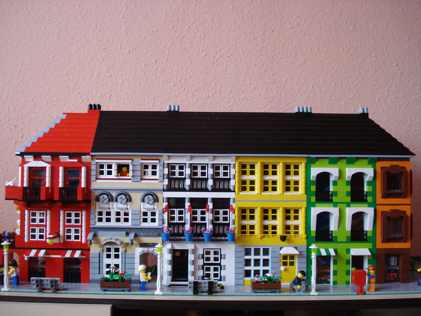
Constructed by Brickshelf member, safiati, this well built city block incorporates many nice colors not usually associated with this style of building. The details thrown into this build are really nice and makes this quite an inspiration, especially for someone like me who is hesitant in using the brighter spectrum of colors for CC buildings. My only suggestion would be to make the roof entirely black, but that easily could have been a part shortage, so it's no big deal. Well done and keep it up!

Funny, I was thinking just the opposite. The single unified roof looks wrong to me. I don't usually see such different buildings covered in a singe roof. All black would be cool but different heights and details (ie: some dormer windows, maybe a couple of chimneys) would make it a lot more realistic.
ReplyDeletetoo mant different styles of building for one unified section for me.
ReplyDeleteYou have a point Ted, I guess I said that wrong. It's just that the red sticks out too much for me. I wouldn't mind a different roof color for each building, but an all black version with some sort of dormers, would be nice. I actually thought I about mentioning that in the description, but didn't.
ReplyDeleteI hear you. Either all black (with maybe some more details) or individual roofs. But really I am being a little picky. I love this block of buildings.
ReplyDeleteI know safiati, he's a fellow MALUG member. A little background on this block: He had built the red one first, some months ago, for a competition inside MALUG. The tan house design he "borrowed" from someone on BrickShelf. The others were built in a rush, his wife told him their guest want to check out his LEGO stuff he just started building frantically, from whatever parts/colors he had in his stock. I don't precisely know how much time he spent on finishing the rest of block, it was probably only a couple of hours per day over a couple of days. So this explains some of the lacking in the MOC - I think it is an amazing work if you consider the circumstances. Also, now he has time to refine it :-)
ReplyDeleteNice design. I agree, the roof should have been pure black but if there was a shortage I can understand. Or, to stay with the theme, the roof could have been color schemed to match each building's design. Either way, this is a work of art... well done.
ReplyDelete