Monday, March 31, 2008

PLUGfest - "Construímos Brincando"


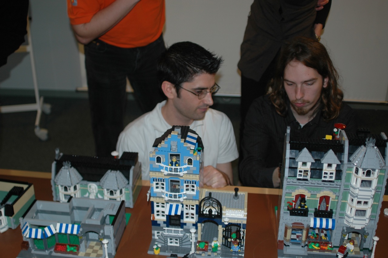
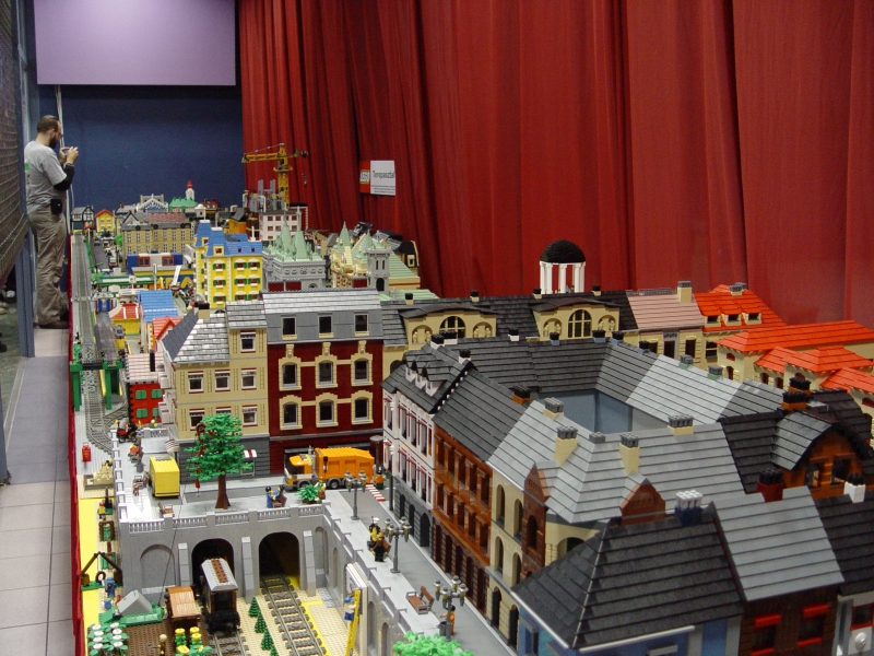
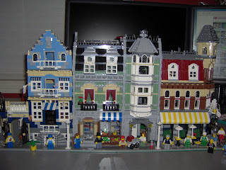
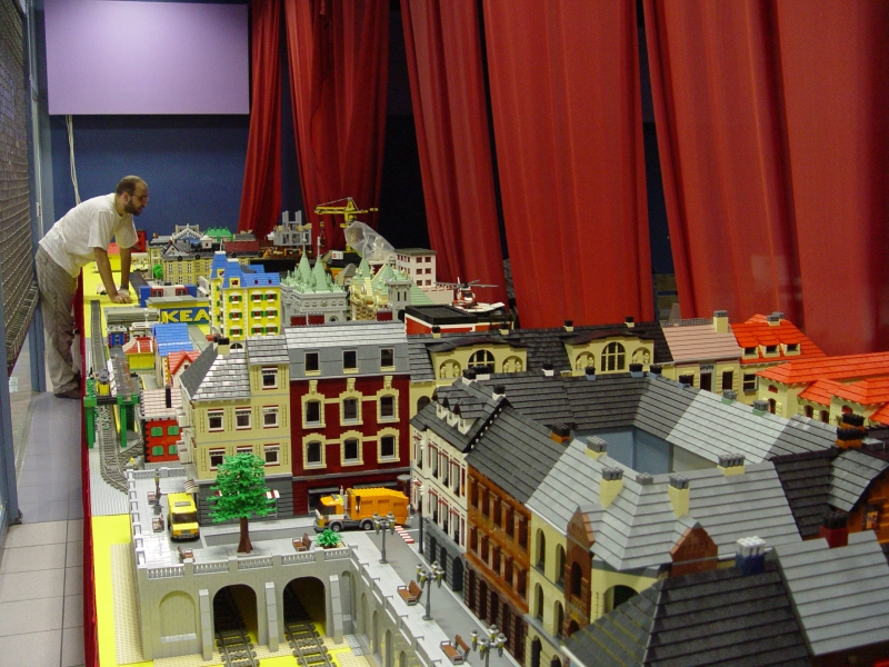
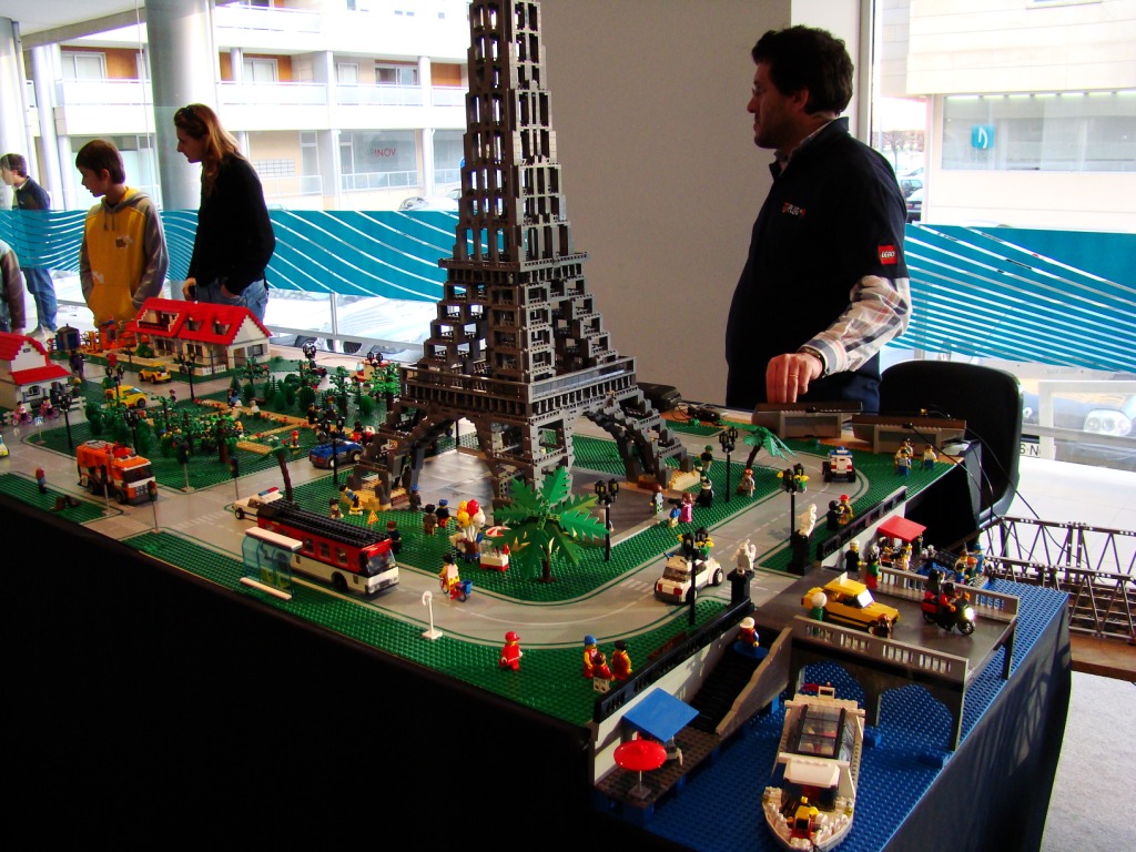
Hello all, I apologize for the lack of interesting posts the last 3 days, however I was very busy in a big PLUG event in the northern city of Braga.


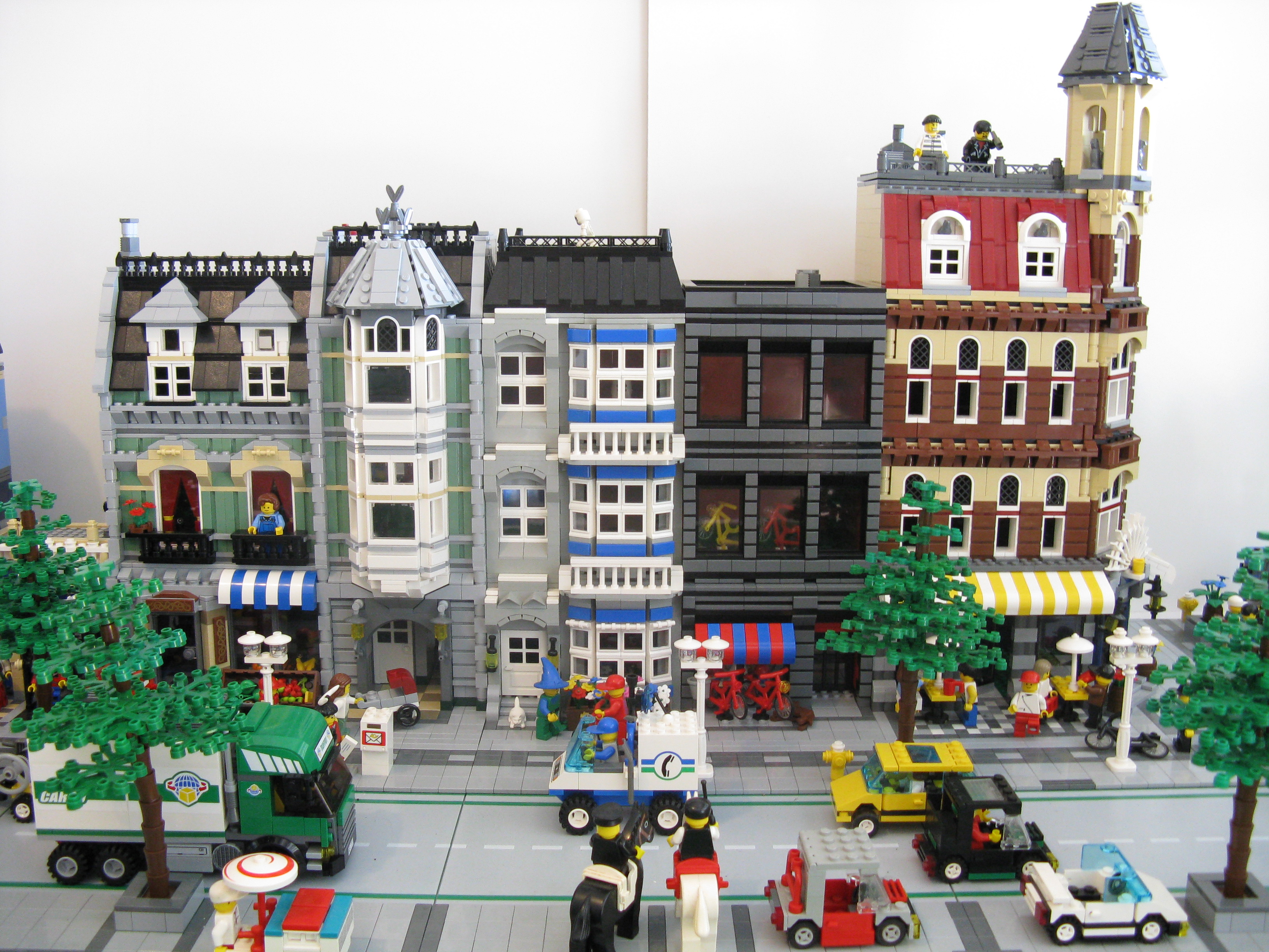
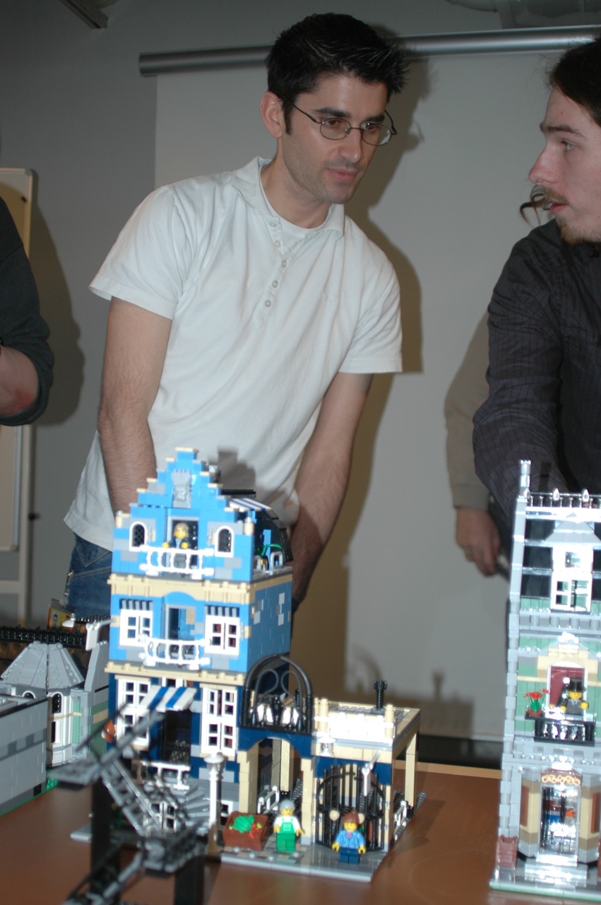
Anyways we had a big layout with some MOCs and a lot of sets, and this city layout was built by me and some friends. Thumbs up to Jorge Reis (guy in the picture) the one that made the layout possible.


Anyways here are some pictures.

Tuesday, March 25, 2008

Manhattan TownHouse - 4954

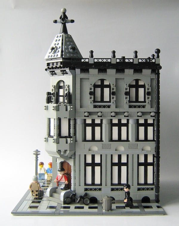
Look, another CC style building made only with 4954 bricks.

From jgptee's gallery.

Cafe De Kroon


Amsterdam - Cafe De Kroon - original design by Gerrit van Arkel - built in 1898 - built in january 2008 by Patrick Bosman.
From oppienokki's Gallery.

Monday, March 24, 2008

Boots - Hitchin

Its stopped snowing, but I'm still drawing.

Factory MOC

Hi all, today I'm presenting a MOC made for a contest inside the PLUG (portuguese LUG), the theme was Industry and there were also some sizing limitations.

So I thought what better to do than a modular factory? For me it was perfect.

Wish me luck no results yet.

See more at the PLUG gallery.

P.S: any sugestions?

Orange Shop


Its snowing in Hitchin today, so its too cold to go in the loft. Thought I'd do some drawing instead.

Sunday, March 23, 2008

Happy Easter!

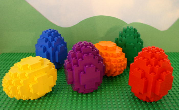
Happy Easter for everyone!
From Richard and Roger
.
.
Picture from mwv1970's gallery.

Saturday, March 22, 2008

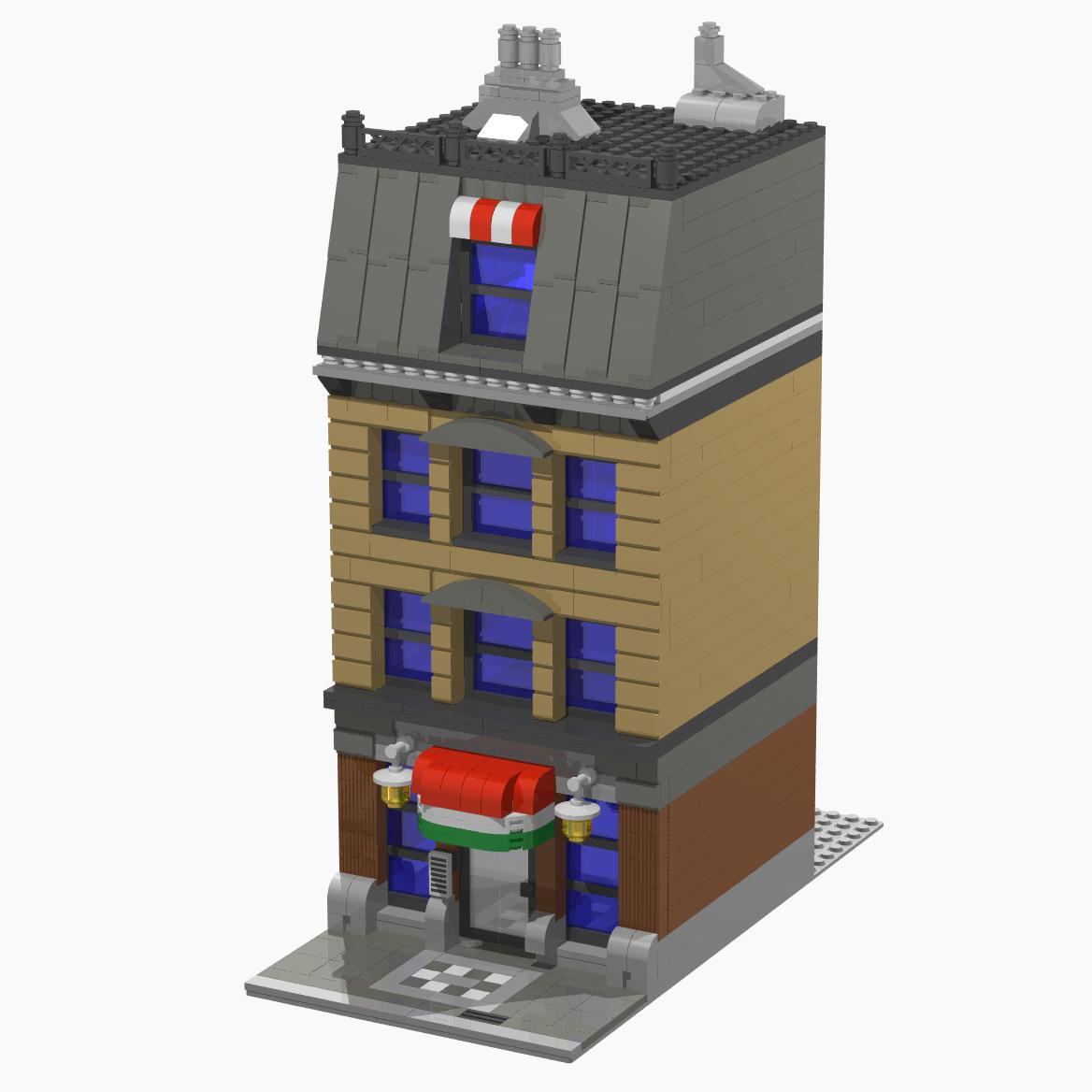
Pizzeria by Sheep

From Sheep's Gallery.

Nice looking awning, by the way.

Make sure you check out his folder, really cool stuff in there including other prior versions of this pizzeria.

Green Grocer Joins Layout.


Thank you for your message LEGOgarage.
I particularly like the black bicycle thrown casually infront of Cafe Corner. The kids on my street (in real life) do that on the path, usually in a shop doorway so that you have to climb over them. Lol. Can I use your idea for tree trunks and street lamps?

Friday, March 21, 2008

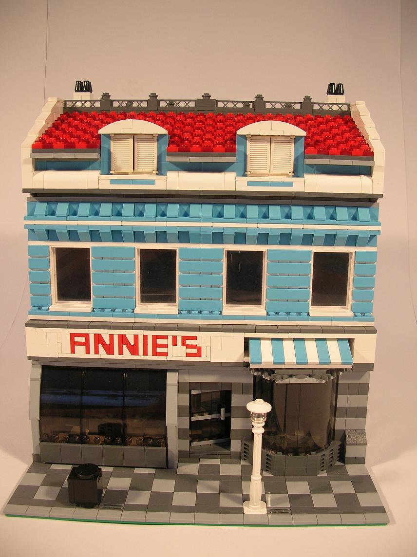
Annie's by EdDiment


Cool details there! And... is that Maersk blue?

From EdDiment's Gallery.

Monday, March 17, 2008

So far so good

Now here is a good example of a work in progress facade. When I build directly in the physical world I usually start like that too, makes sense: first the structure then the gaps.

So far so good howsuch I'm loving it!

From howsuch's gallery.

Sunday, March 16, 2008

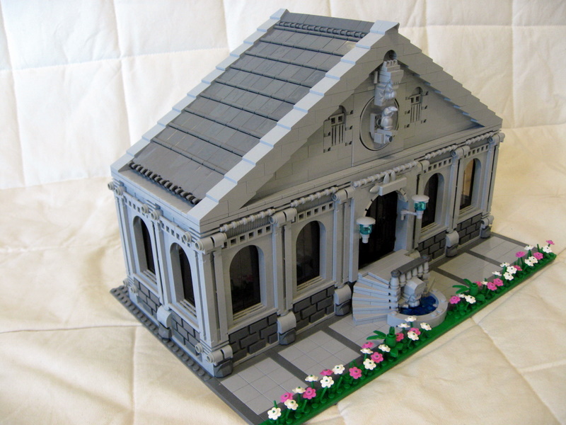
City Museum, MOC

From gony's gallery.

"This museum building was built with very unique pilar pieces and heavy roof that consumed 235 pieces of tiles"

By the way Gony, if you like this kind of buildings with classical temple shape, you should probably be interested in a book called: "De Architectura" it's Vitruvious architecture book. It talks about the proportional relations between the size of the pilars and the height of the building itself, as well as other stuff more unrelated to this kind of building, lets not forget it was written around 15 b.c.

Monday, March 10, 2008

Cubs Day Out.

I've been really looking forward to these guys arriving through the post.

I've arranged the cub pack playing havoc outside The Green Grocers and in the Town Plan fountain.

When my layout is finished I intend to put these little fellows camping on a hillside over looking the sea.

The pieces were bought from the Bricklink Store Simplybricks.


Duna Plaza Layout II

A good friend of the blog, Akos, gave us a complete explaination about the layout and its participants.

"This town layout will be on display through March in Duna Plaza, Budapest, Hungary. It is part of a LEGO exhibition. The raised section on the extreme right is by "brob". He has been building his MOC layout for about 18 months. That's not a lot of time, but he started before CC was released and he did not consider switching to CC as his original intention was to build a fixed train layout for the home, for his son to play with. This is his second show with us, it looks like he will be a regular participant. He's got a rural section as well, but he did not bring it to this layout. The middle-right section is by Tibicsoki, he is a pretty unusual builder, who can go to extremes. He can build the ugliest house, and we can't convince him it should be demolished at the earliest occasion. On the other hand, he also built that cathedral, and in just 3 weeks. He is also very good with scenes, he built the flee-market scene and the vegetable patch "impromptu". He is not a CC builder either. (We have "invented" a CC-like standard in 2004 and he is still keeping to that standard.) The next middle-left section is by me. This is the first time I used my black tile streets. My new square and the wide streets let my houses to breathe. (Not to mention it was cheaper than building 8 more houses.) A club member suggested that I integrate my vintage stuff into the modern era town by making it a movie shooting. I did some last minute building and came up with some "movie" MOCs. My part is the only CC-ish section in the layout, but I have to tell that I also moved away from true-CC a bit. I got a few thousand 2x2 bricks so I could finally build the missing walls for my houses. (I only built facades before.) Now that my houses were "full", the integrated sidewalks had to go. I have replaced the 32x32 (or 2x16x32) baseplates "under" each house, and the sidewalks are on their own baseplate now. This way they can be packed away into smaller boxes. The leftmost section was filled with MOCs by "small" builders who don't have enough stuff to fill a whole section. They are GP, Lezly and piszkosfreddy. There were some individual MOCs that ended up in Tibicsoki's section. (By GP, Gyurma77 and Matyo)."
Thank you very much!

Duna Plaza Layout

Although we have already posted this layout on the blog, the pictures we showed we only the setting up, so here they are the definitive ones.

You will be delighted looking at all small details that make this layout come to life (and I can see some of your buildings Akos :D What can you tell us about the layout?)

Check out more at piszkosfreddy's gallery.

Sunday, March 9, 2008

10185 Green Grocer - Reviewed!


Eurobricks member Dunamis is the first to make a detailed review of the set we all love: GG

Check it out, there are lots of great pictures of many cool details.

Saturday, March 8, 2008

Brick Journal.


As Jamie mentioned - there is an interview with him in this issue of Brick Journal. Click the picture for the link.

Cut Aways


nexus7 has photographed some of the details that are hard to see (e.g. the mouse hole and the mouse eating cheese).

Wednesday, March 5, 2008

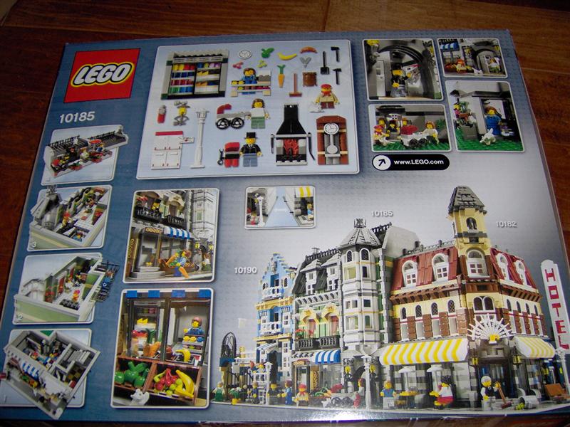
Back of the Box II


I thought I'd add these images to describe what I meant in the previous post. - Enjoy.


Back of the Box


This is from dunamis's gallery.

I really enjoyed looking at the box art when I bought my own Green Grocers - especially the picture (top middle) of all shelves, fire place, clock etc.

Monday, March 3, 2008

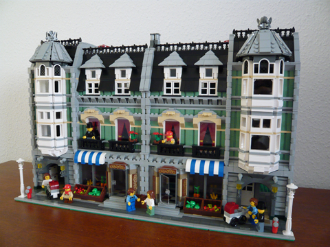
Two Grocers


Now this is something I didn't expect to see so soon: two green grocers side by side.


Still it's from Jamie's gallery so it's not that suprising after all.

Sunday, March 2, 2008

Brickshelf: "Enjoy an ad free weekend!"

When I connected to brickshelf today I saw this message "Enjoy an ad free weekend!"
Feels kinda nice not to have those anoying ads, even if it's just a weekend.

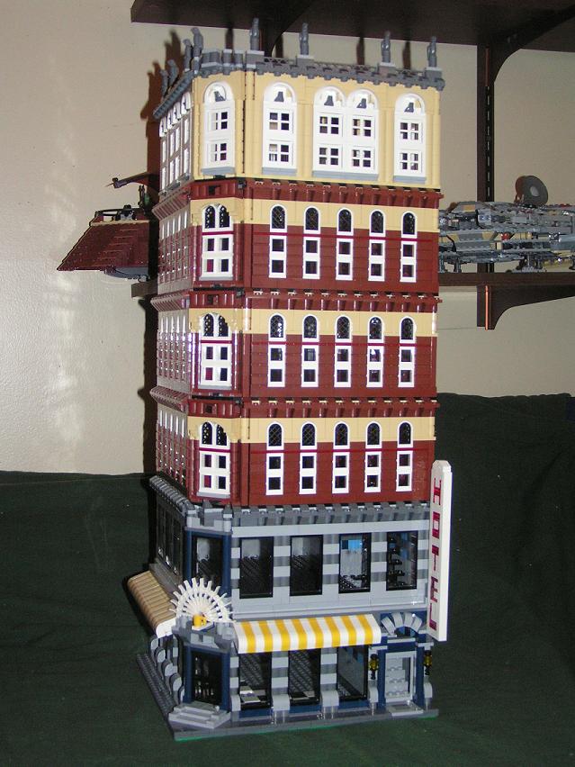
6 Story MID-RISE Cafe Corner MOC

Three modular buildings have been released so far, and guess what: Modding the CC is still cool!

Look at this one 6 stories and still looks balanced!

From 501stclonetrooper's Gallery.

Saturday, March 1, 2008

Its in the bag!


I GOT ONE!!! Yey.

I read on Eurobricks yesterday about a guy who went to the LEGO Shop in Milton Keynes. I went there first thing this morning.

They had one already built - it looks even better in real life. They put out another two for sale.

It cost me £100

Hope to bring more photographs later today (if there's anything in particular you'd like to see, let me know as there have already been lots of pictures of this set).